Virtual Door Knock

Replacing a knock on the door with a templated text message sounds simple. Building it into a platform that wasn’t designed for it wasn’t.

Role:
Designer
Dates:
2023 – 2024
Client:
Captivated

The Challenge

The idea arrived with a name and not much else. Virtual Door Knock. The pitch was simple: lawn technicians don’t like knocking on doors. Dogs bark, kids wake up, and not every tech is the face a franchise owner wants representing their brand. A templated text message could do the job instead.

What came with the idea was a direction, not a scope. No data requirements, no technical constraints, no plan for how a feature like this fits into a platform built entirely around phone numbers. Figuring that out was the job.

keyboard_arrow_up

The Prototype Buys the Time

The first move wasn’t a spec. It was a Figma prototype.

Part of my role was protecting the development team from ideas that weren’t ready. A name and a direction isn’t a feature. It’s a starting point. Building something clickable first let me pressure-test the concept, think through what a real build would actually require, and surface the right questions before anyone was assigned to it.

The prototype did two things. It gave the concept something tangible to travel with, animated interactions, a real workflow, something that could be shown at a green industry conference and come back with signal instead of assumptions. And it bought the runway needed to figure out what shipping this would actually take.

What came back from the conferences was simple: they loved it. When can we build it? That was enough to get it prioritized. It was also when the real work started.

Building the Foundation First

Virtual Door Knock was a geo-location-based feature and Captivated didn’t store addresses on Contacts.

The platform was built around phone numbers. That was the entire data model. Getting VDK onto the roadmap meant solving a problem that predated the feature: Contacts needed address fields, and not every organization needed them. The solution was a toggle at the organization level. Address fields only appeared if the org had them enabled. A second toggle controlled geo-location specifically, adding lat/long fields to contacts and triggering automatic conversion for any address already in the system. If a client’s CRM already had lat/long data, we could import it directly rather than paying a third party to generate what already existed.

The import pipeline needed to expand too. Accepting address, city, state, zip, and lat/long fields sounds straightforward. Data validation is not. Partial addresses, inconsistent state codes, missing postal codes, edge cases that couldn’t be rushed. Getting the foundation right mattered more than hitting a date.

Captivated’s mobile apps ran on Capacitor, a framework that bridges web code to native iOS and Android. Relying on the device’s geo-location meant the version of Capacitor in production had to support it reliably. That meant an upgrade before testing could even begin. Not glamorous work, but without it nothing else moved.

None of this was in the prototype. All of it had to exist before a single line of VDK code was written.

Fitting VDK Into a Monolith

With the foundation scoped, the feature still had to work inside an architecture that wasn’t designed to support it.

Captivated organized its data around Organizations and Accounts. An Organization might be a single lawn care company with one Account, or a franchise with dozens representing individual locations. VDK was the first feature that needed to live at the Account level, which meant solving for a pattern that didn’t exist yet in the platform. One location could pay for and enable VDK without it surfacing across every other Account in the org. Access was then designated at the user level too. Not every person on an account was a field technician. Office staff and receptionists didn’t need a geo-location tab on their device.

Templates presented the same challenge. They lived at the Organization level, available across every account by design. VDK was the first feature that needed templates to belong exclusively to the account using them. Rather than restructure where templates lived across the entire platform, VDK got its own designated template type, scoped to the account, separate from everything else.

Every one of these decisions had to be made before the mobile experience could be designed. The feature the tech sees is two swipes and two taps. Everything underneath it took time to get right.
Putting It in Front of the Right People

The prototype wasn’t just a scoping tool. It was the research. An animated, clickable workflow traveling to a green industry conference and landing in front of the people who would actually use it was more valuable than anything a survey could have returned at that stage. The concept needed a reaction from the field, not a form.

What came back was informal. Word of mouth, conversations at a booth, no session notes or recorded feedback. But the signal was consistent enough to prioritize the build. That was the goal.

Trying to Hear From Users

Once VDK shipped I put together a heuristics survey and tracked down every user I could find. Ten, maybe twelve people. The green industry runs hard from early spring through late fall, and asking field technicians to stop and fill out a survey mid-season wasn’t realistic. Nobody responded.

A second survey went out just before I left. I never got to see what came back.

Designed for the Field

Virtual Door Knock had one user in one context: a lawn technician standing next to a truck, ready to treat a yard. They weren’t sitting at a desk. They weren’t going to search for a contact, navigate menus, or read instructions. The design had to work with that reality, not around it.

The feature surfaces the five closest contacts to the technician’s current location. Not a list they build, not a search they run. Five contacts, ranked by distance, ready to act on. That number was deliberate. Enough to account for imprecise geo-location data without overwhelming a screen that needed to stay simple. If none of the five were right, a bad data problem wasn’t something a tech should solve in the field.

VDK is also mobile-only. There was no version of this feature that made sense on a desktop. Suppressing it on non-mobile devices wasn’t a limitation, it was the right call. A geo-location tool for field technicians has no business appearing in an office.

The Swipe Interactions

Every interaction was designed to reduce the number of decisions a tech had to make.

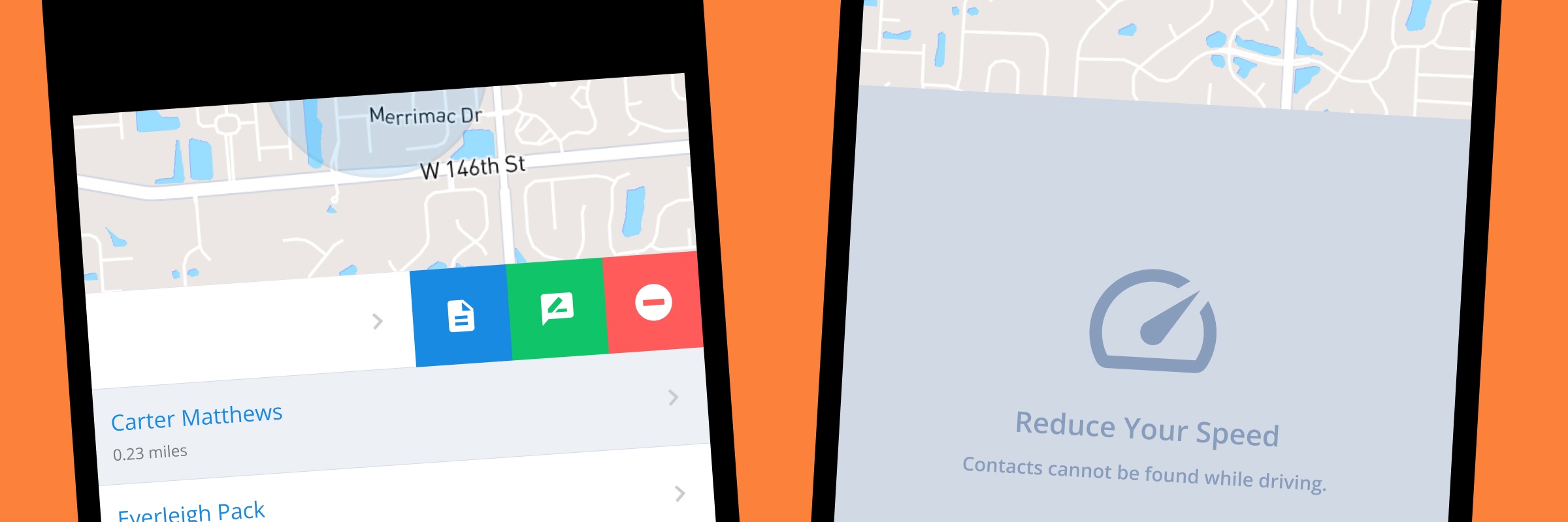
Swiping a contact reveals three options: remove, message, or template. Selecting template slides a bottom sheet up from the screen with only the VDK templates for that account. A second swipe reveals the send option. Two swipes, two taps. The tech never leaves the flow to find a contact, open a conversation, or navigate to a template library.

After the message sends, the app opens the conversation screen. Familiar territory. No new screens to introduce, no confirmation modal to dismiss. If the customer replies, the tech is already where they need to be.

The Speed Limit Restriction

A geo-location feature that works while driving is a distracted driving problem. The map won’t load contacts if the device is traveling faster than 12 MPH.

The idea came from Pokemon Go, borrowed as a way to keep the tool from becoming a distraction behind the wheel. The restriction generated the most immediate feedback after launch, but not for the reason I expected. Users hadn’t granted the app precise location access, so their position jumped around on the map even when standing still. The fix was two-part: reduce the MPH threshold to account for location drift, and surface a prompt encouraging precise location permissions on first use.

The Radius Setting

Not every technician works in a residential neighborhood. A tech servicing properties in a dense suburb operates in a very different environment than one maintaining ponds and irrigation systems across rural acreage.

A fixed radius would have broken one scenario or the other. The default is .2 miles, tight enough for residential use, but configurable up to 20 miles for accounts that need it. The setting lives at the account level, set by the admin, not adjusted by the tech in the field.

The Tech Avatar and Geo-Stamp

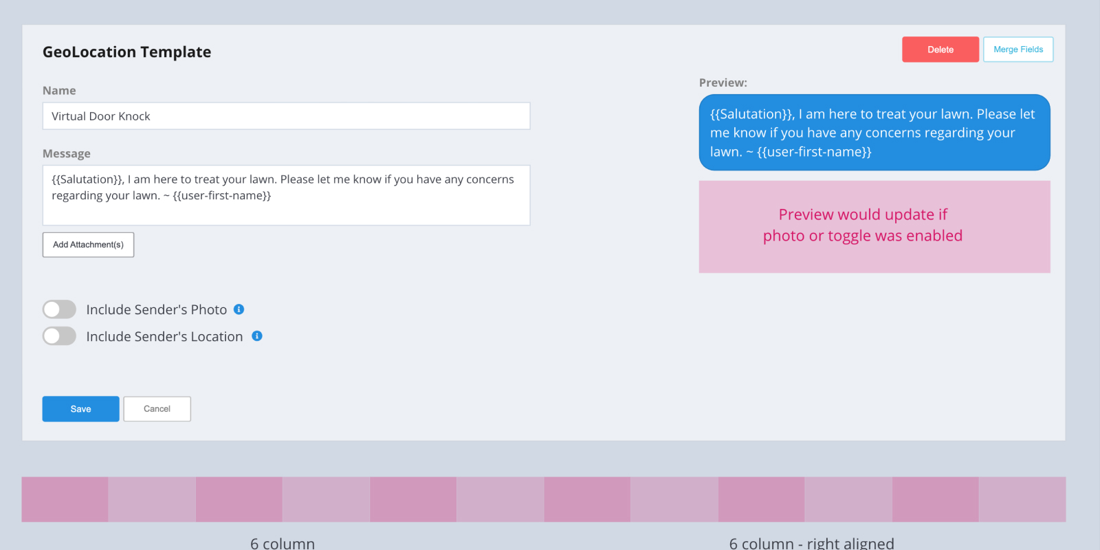
A templated text message can do more than replace a knock on the door. Two optional toggles on the VDK template let accounts decide how much information travels with the message.

The first attaches the technician’s profile photo. Some franchise owners want the customer to know who is on their property. Others don’t. The second embeds the technician’s geo-location at the time of send, a verifiable record that the tech was on site. A virtual equivalent of the “just treated” sign left in the yard, timestamped and tied to a location.

The Non-Happy Paths

Two scenarios required specific design decisions that the swipe interaction alone couldn’t handle.

The first was missing merge field data. VDK templates could include dynamic fields that pulled in customer information. If that data didn’t exist for a contact, the message would send with a blank where the customer’s information should have been, reading like an error. A warning surfaced on the template card before the send option appeared. If the tech selected it anyway, a prompt asked them to fill in the missing value before the message could go out.

The second was opted-out contacts. An opted-out contact can still appear in the five closest, but they can’t receive a message. Rather than hiding them or blocking the swipe entirely, the established opt-out icon, a red ban symbol already used elsewhere in Captivated, appeared next to the contact name. The send and template options were disabled. The tech could see why without needing an explanation.

Neither scenario blocked the workflow. Both guided the tech to the right next step without interrupting the experience for contacts where everything was fine.

The Empty State

If a tech dismissed all five contacts, or if no contacts existed within the current radius, the screen returned an empty state. A “Search Near Me” button reset the view and fetched the five closest contacts again. If the data still wasn’t there, it returned empty. The feature doesn’t guess. It shows what the system knows.

The Admin Screens

The geo-location tab didn’t appear on a technician’s device by accident. Before any tech could use VDK, an admin had to enable it at the account level, designate which users and teams had access, configure the search radius, and set up the VDK templates. Every one of those settings lived on a new VDK card added to the organization’s admin screen.

These screens weren’t built after the feature. They were built in tandem with it. The feature and its configuration had to ship together. One without the other wasn’t a product.

Virtual Door Knock shipped as a zero-to-one feature inside a platform that wasn’t built for it. No address fields, no geo-location support, no account-level feature toggles, none of that existed before this project. By the time VDK launched, all of it did.

Year one adoption was modest. VDK shipped during the green industry’s busy season, and asking clients to implement and train on a new feature mid-season wasn’t realistic. The product sat on the shelf until the season wound down. By the 2025 season, more accounts were adopting it and the feedback coming back was positive.

The survey I sent to early users never made it back to me. But the roadmap was already clear. VDK was next in line to be rebuilt as a proper React module, following the strangler pattern the team had started using to modernize the platform one piece at a time. Its small footprint made it a natural candidate. And with a real authentication and authorization layer in place, the cumbersome account and user-level toggles required in v1 could be replaced with something the system already knew how to do.

The feature worked. The process that produced it worked. A vague idea and a name became a shipped, adopted, and already-improving product.

More Case Studies