Platform One (P1)

A vial doesn’t just hold a bio-sample, it holds data too. I mapped that sample’s entire lifecycle, PM to CC to lab tech to storage, to design a Data Management Module that could do in software what was being done by hand.

Role:
Researcher
Dates:
2019
Client:
Brooks Life Sciences

The Challenge

Brooks Life Sciences needed to replace a 17-year-old legacy application with something modular and commercially viable. The primary goal was to retire a system stretched too thin. The secondary goal was to build a replacement that could be sold as a piecemeal solution. The Data Management Module was chosen to go first. It bridged a gap the legacy system had never addressed and could stand on its own as a product.

keyboard_arrow_up

Starting With the Right Pattern

The plan was to use a strangler pattern, replacing the legacy system with new functionality one module at a time rather than rebuilding everything at once. That decision shaped everything. It meant the Data Management Module wasn’t a redesign of something that already existed. It was net-new functionality, with no existing UI to reference, no known users to inherit, and no established workflows to map. Everything had to be discovered.

The Hypothesis

A user-centered, iterative approach would produce a better product, both for internal use and for the future customers Brooks wanted to sell it to. That meant getting in front of users before a line of code was written, and staying close to them throughout the build.

Integrating Into the Team

For some teammates, this was their first time working with a UX practitioner. I knew early on that research findings land differently when the team feels invested in the questions being asked. Before diving into user interviews, I distributed a Semantic Differential Survey to the team to surface where there was alignment and where there wasn’t, and to let everyone have a hand in defining what P1 should be.
Learning the Industry

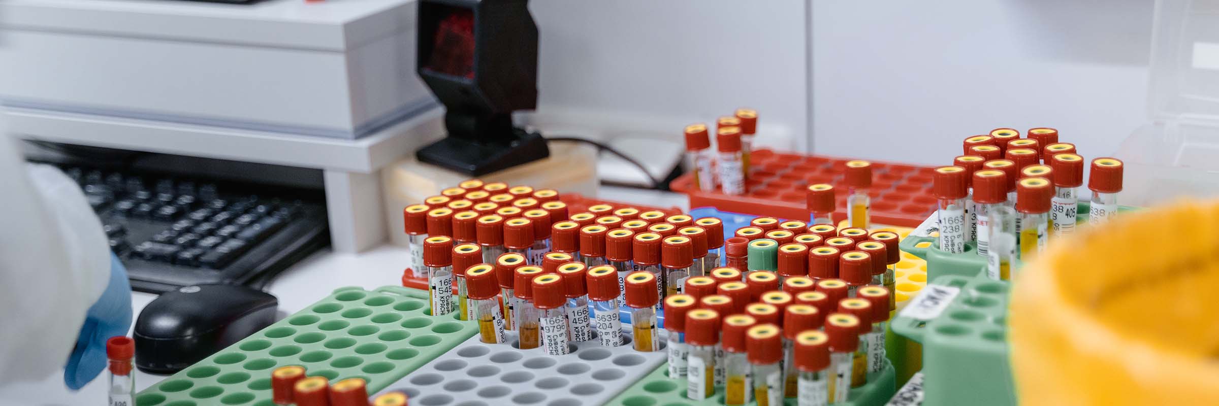
The biological sample storage industry has layers. A sample arrives in a container. A manifest arrives separately, a spreadsheet containing up to 80 data points about that sample. The two have to be matched, validated, and reconciled manually. A large storage facility is doing this for millions of samples. Clean, accurate data is critical because errors are expensive to fix and the data is as valuable as the sample itself.

Shadowing the Chain

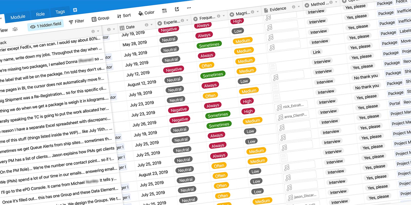
I interviewed and shadowed every role in the workflow: Project Managers, Client Coordinators, and Operations Techs. Each role had a distinct job to do and a distinct relationship with the data. I recorded audio for most sessions and used Microsoft Teams screen recordings for workflow-heavy interviews, capturing what users actually did, not just what they said they did. Everything was logged into an Airtable insights database with the recordings attached as evidence.

Insights Database
Research findings were saved in the Insights Database

Defining the Users

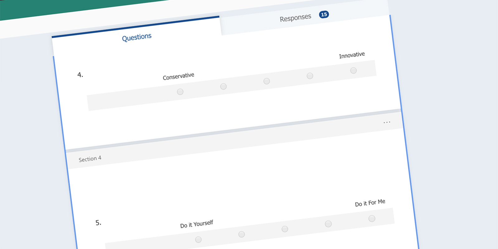
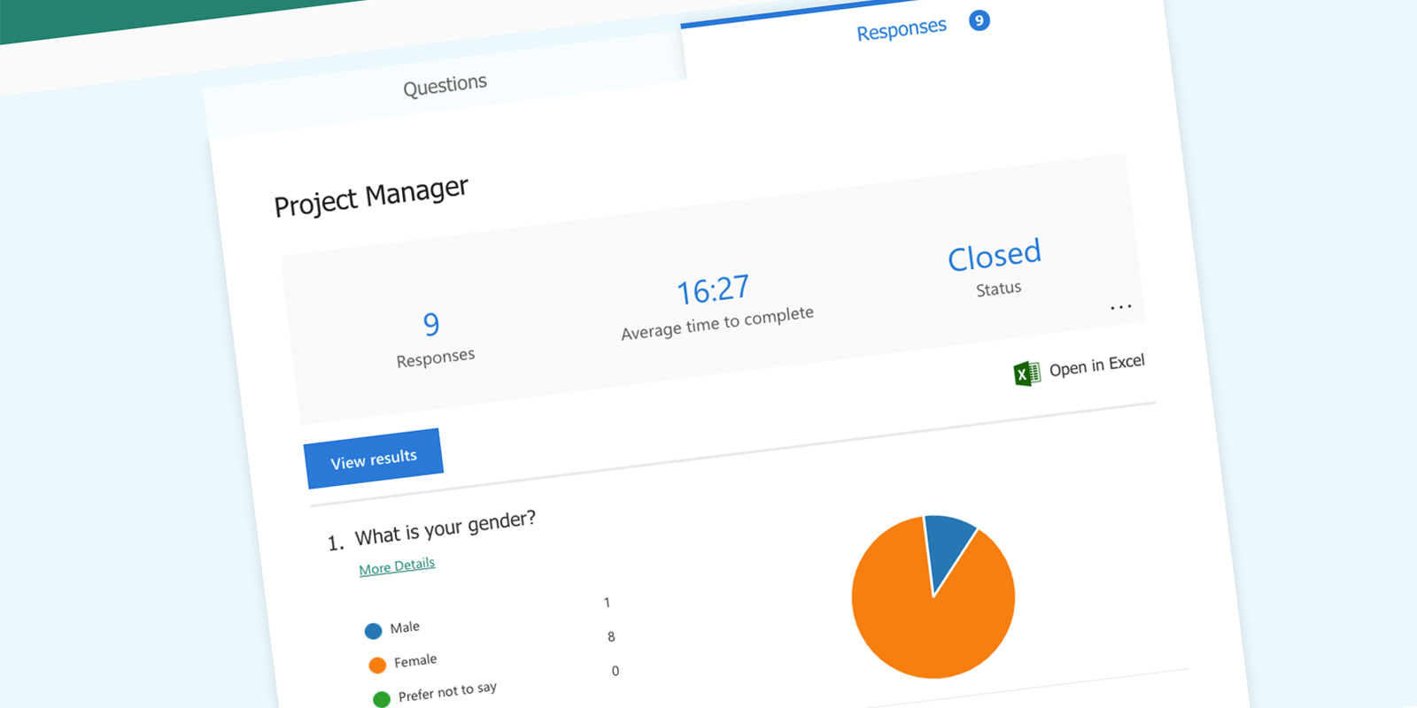
With no existing personas to reference, I built them from scratch. I used Microsoft Forms to distribute persona surveys once I had enough interview data to frame the right questions. User A emerged as a Project Manager or Client Coordinator, the person responsible for defining what a profile needed to look like before any data arrived. User B was an Operations Tech, the person who would eventually upload the manifest and run it through the profile.

Persona Survey results in Microsoft Forms

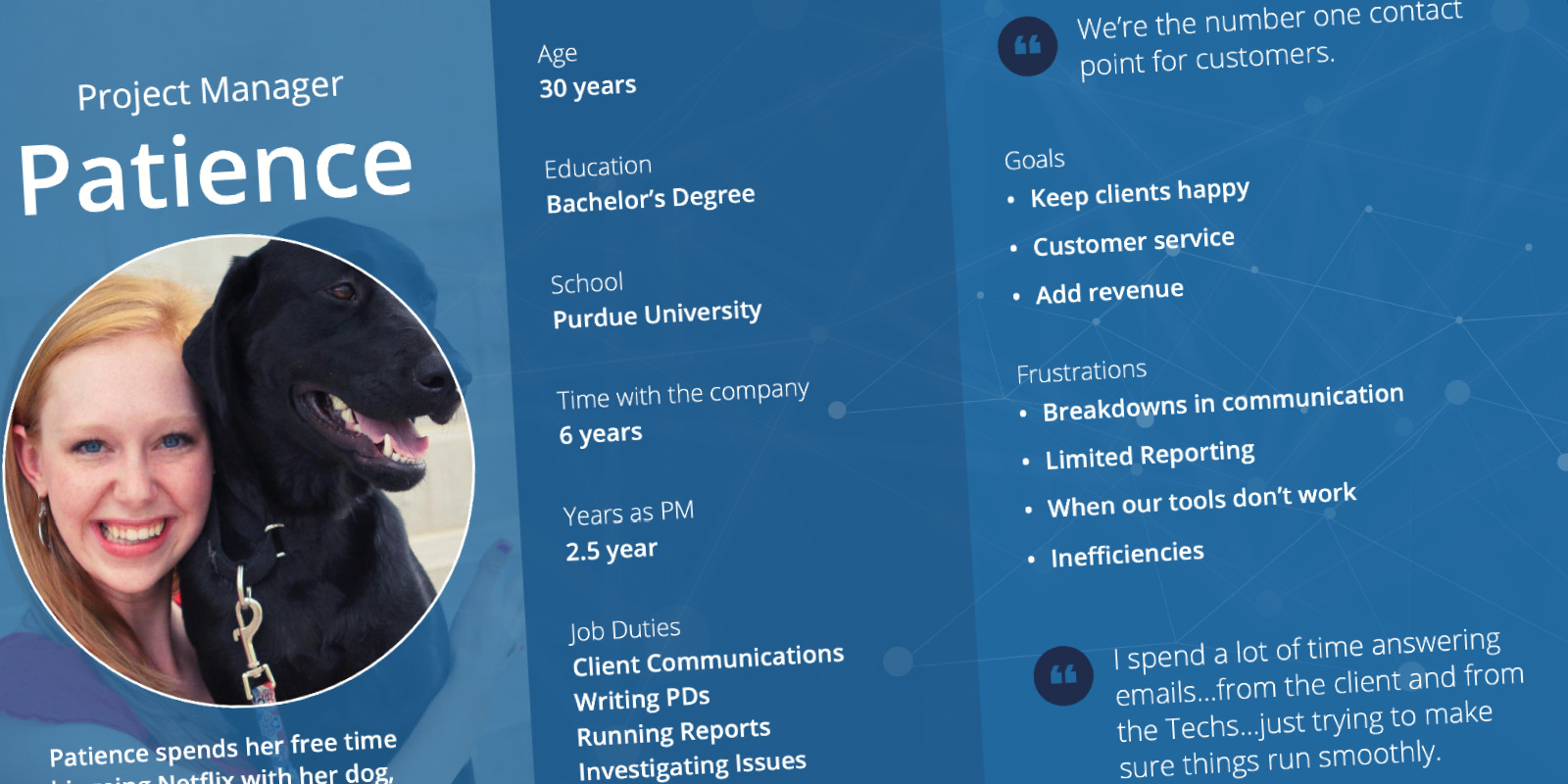
I created personas from the survey data. Patience the PM captured the User A profile. View her personalaunch here.

The PM persona
The PM persona, identified as a potential User A

What the Team Thought P1 Should Be

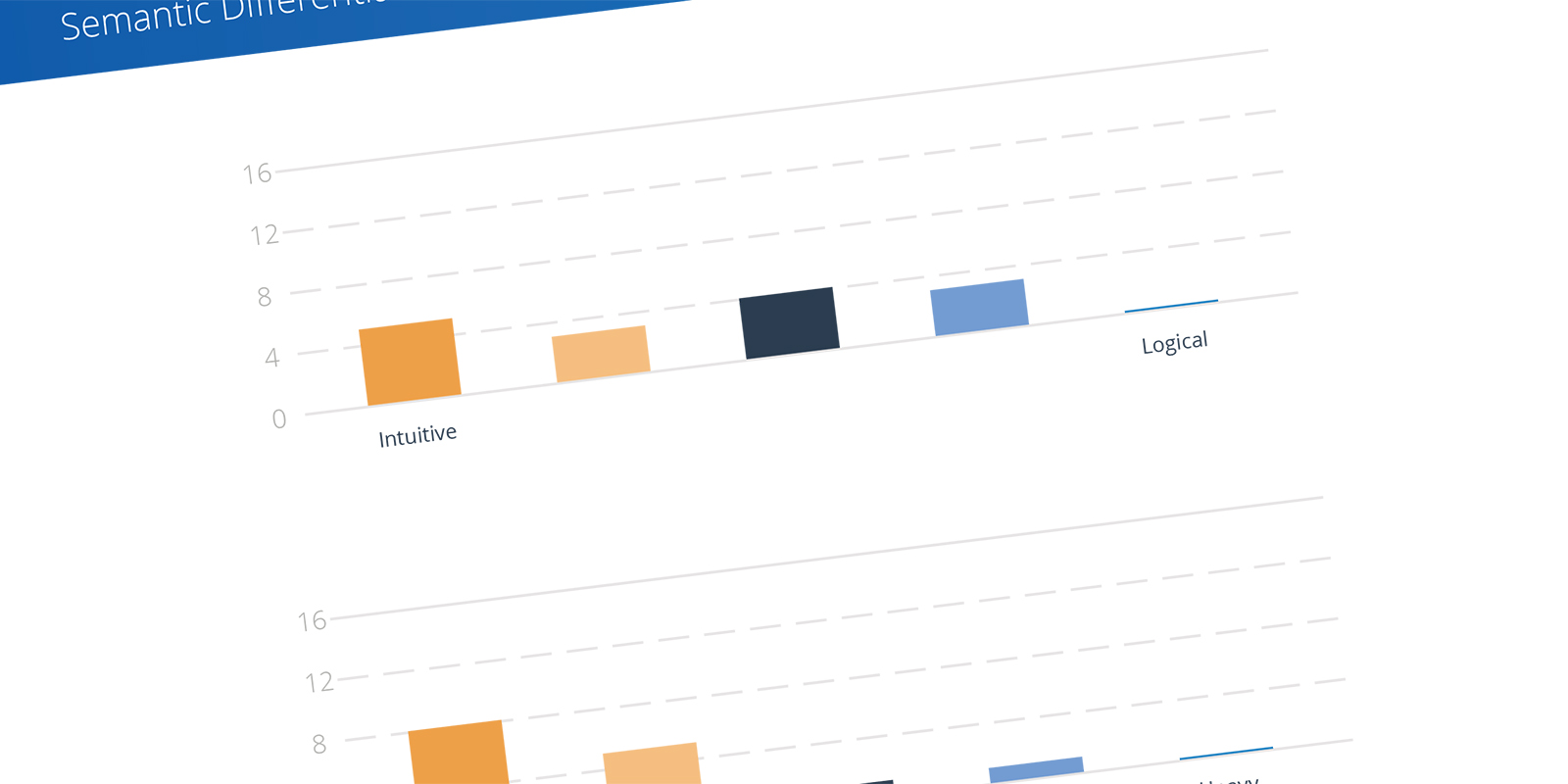
The semantic differential survey I ran with the team surfaced real alignment gaps. Everyone agreed P1 needed to be clear, organized, fast, and straightforward. The areas that needed more conversation were Tailored vs. Off-the-Shelf, Sufficient vs. Perfect, and Intuitive vs. Logical.

Semantic Differential Survey
I surveyed the team on several semantics to get alignment

I posted the results on a team whiteboard to keep those attributes visible as design decisions were made.

Semantic differential results document
The team’s vision for P1: Intuitive vs. Logical

Pain Points and a Narrowed Scope

The interviews answered a lot of questions and raised new ones. The biggest gaps were around communication between roles. How would an Ops Tech know a profile existed for their manifest? Who would be responsible for the mapping? How would issues get communicated back to PMs? The Ops Tech’s workflow was entirely dependent on the PM completing a profile first. That dependency made the decision straightforward: start there. Narrow the problem space to profile creation and solve that workflow completely before expanding.

Prototyping and Testing

With the profile workflow designed, I built a clickable prototype in Sketch and InVision and recruited six internal users to test it. Four were able to participate. The script walked participants through two mapping tasks, one simple and one more complex, to pressure-test both ends of the workflow.

A clickable prototype
Creating a prototype to test with users

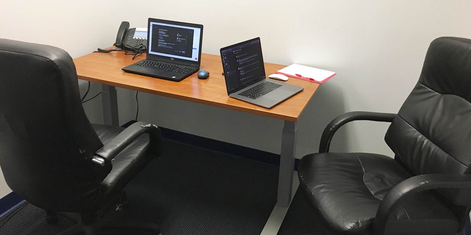
I ran the sessions in my makeshift usability lab, joining a Teams meeting from two laptops so I could record both the participant’s screen and their face simultaneously.

My makeshift usability lab

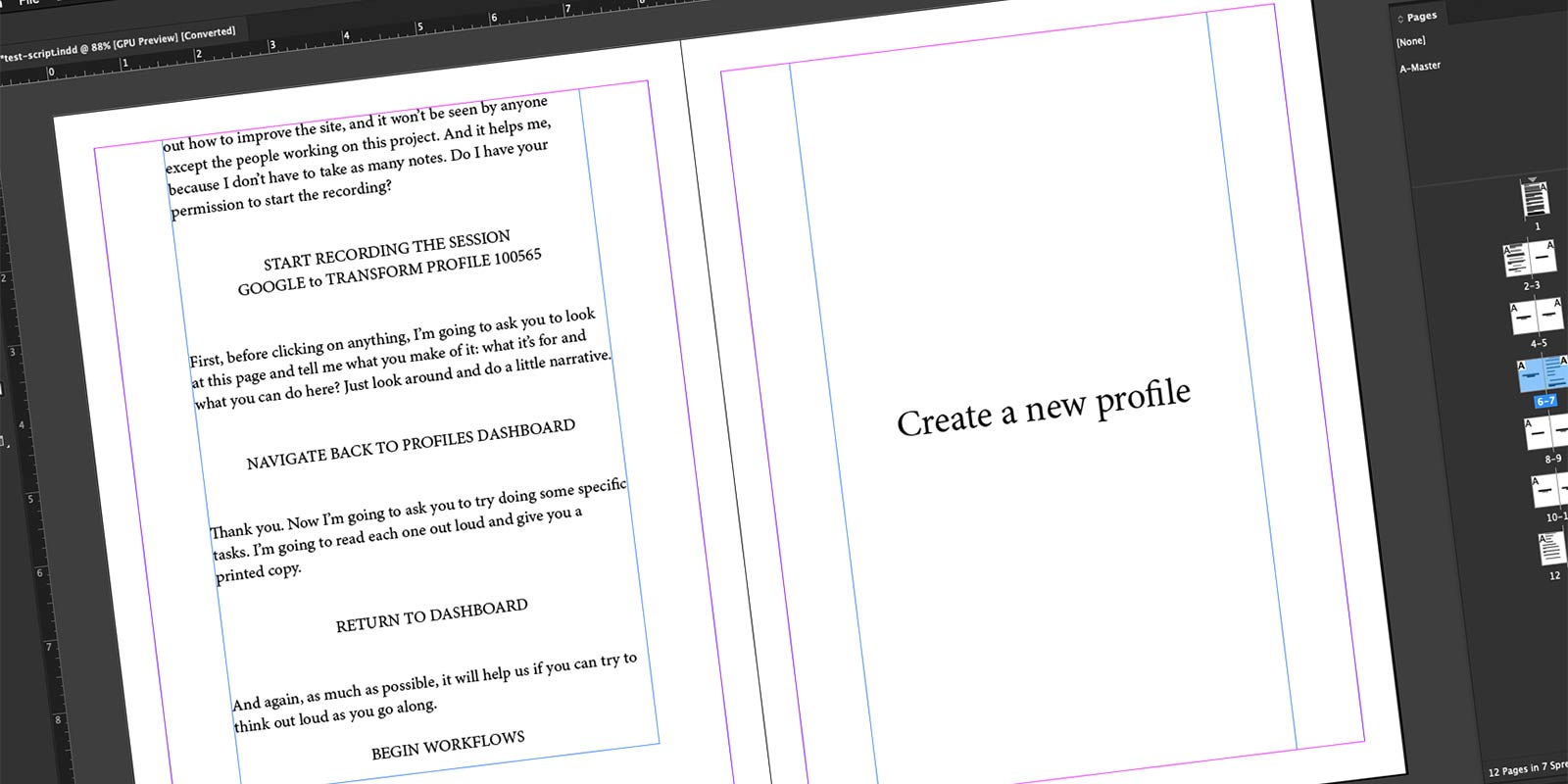
The script was also designed to answer lingering team questions: who would actually perform this task in practice, and when would they have everything they needed to create a complete profile.

The test script
The test script created to validate the prototype

I recorded every session, cut the footage in Adobe Premiere into focused clips, and shared them with the broader team. The clips were also uploaded to the Airtable insights database, connecting the findings directly to the evidence.

One participant completing the simple mapping

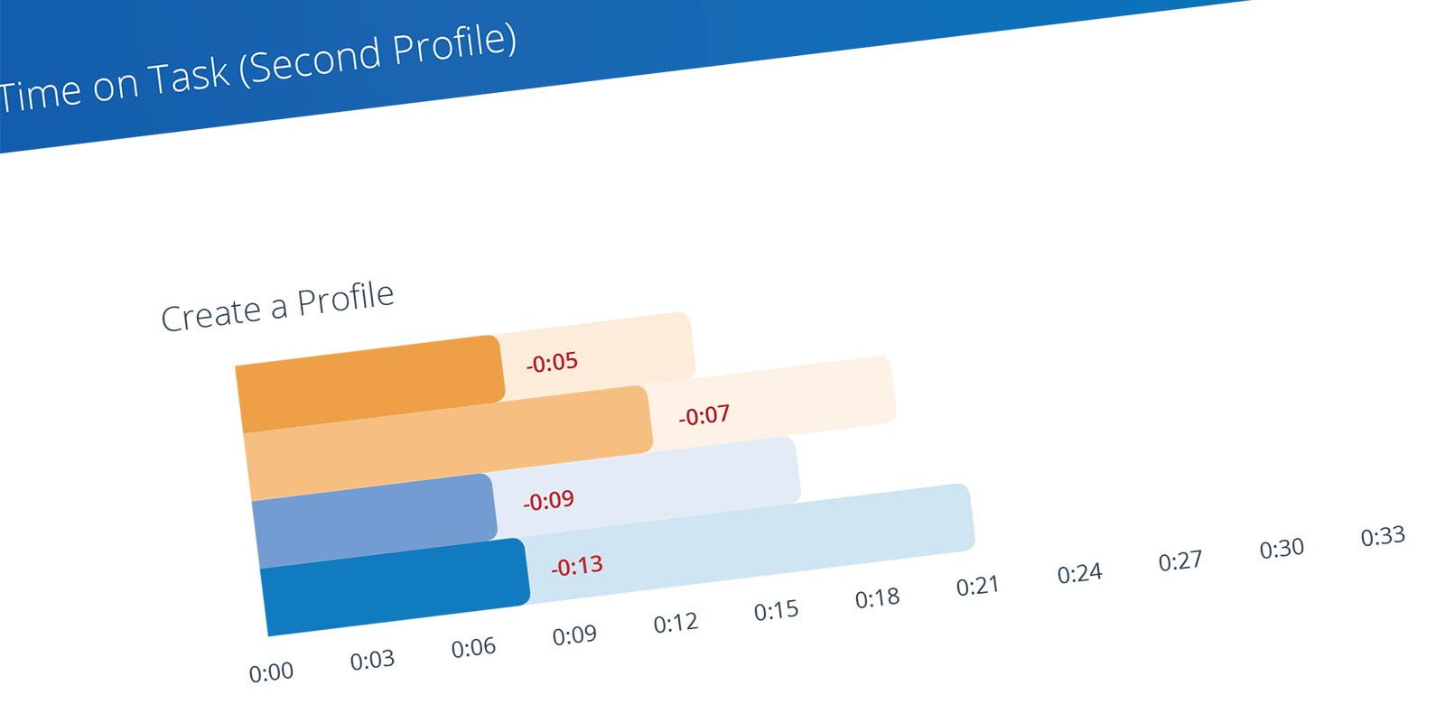
I compiled everything into a readout documentlaunch and presented the findings to stakeholders.

The usability readout document
The results of the usability tests were documented and shared

CodeFreeze

Before any P1 user stories were written, I built a design system called CodeFreeze. The name was intentional, a nod to the bio-sample freezing at the core of Brooks’ business, and a signal that the UI foundation was something the whole platform could be built on, not just this module.

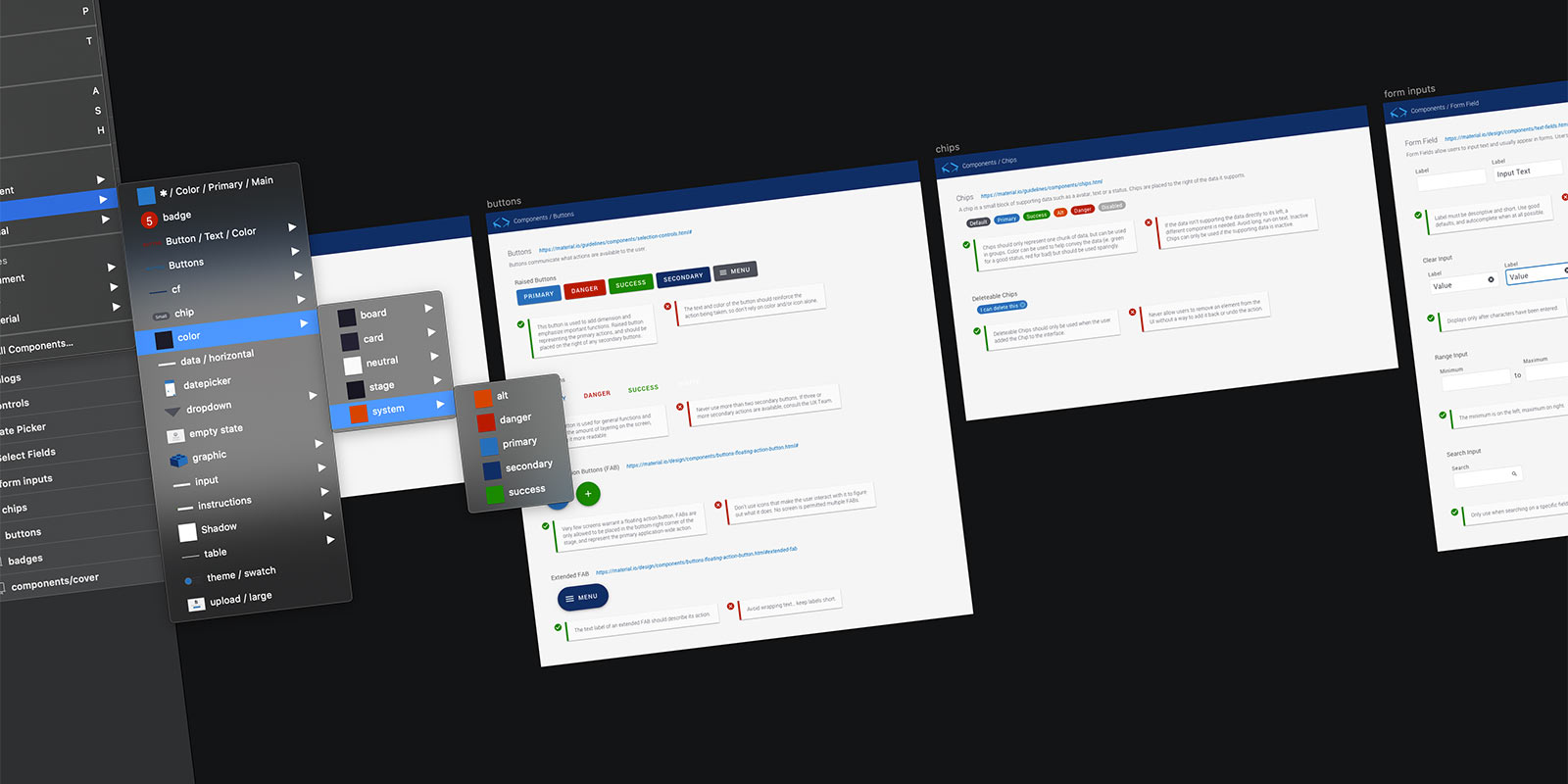
CodeFreeze was built on Google Material UI and themed by me to fit the product. The decision to start with Material gave us a proven component foundation to work from. The theming gave P1 its own identity. And because CodeFreeze was designed to scale across all future P1 modules, not just the Data Management Module, getting it right early meant every module that followed would inherit a consistent, production-ready UI without starting from scratch.

I recruited a front-end engineer I’d worked with previously to bring CodeFreeze to life in code. Having the UI foundation handled before the build started meant I could stay focused on user tasks and workflows instead of component decisions mid-sprint.

Building themeable components in Sketch

Creating a Profile

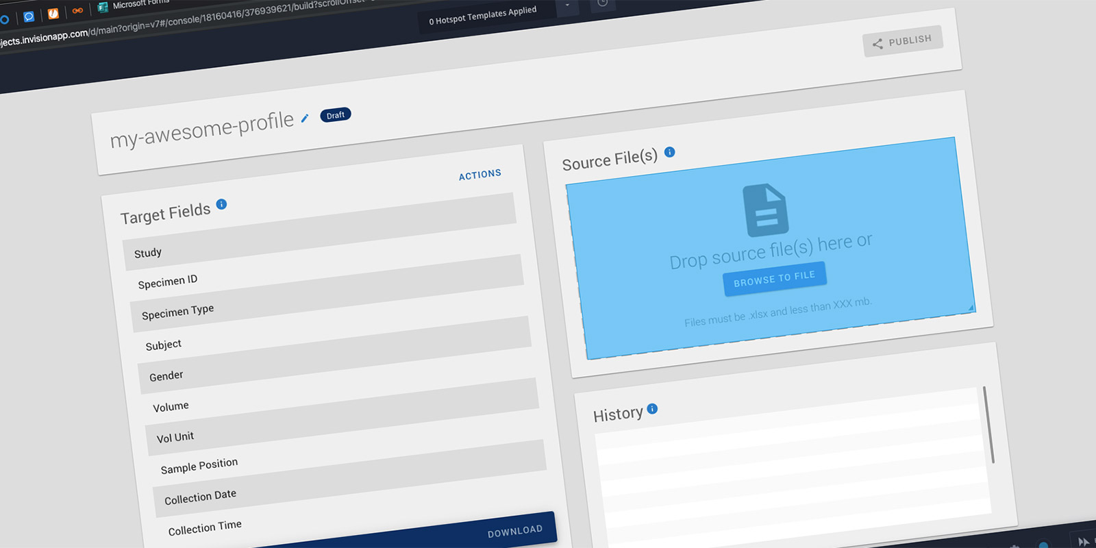
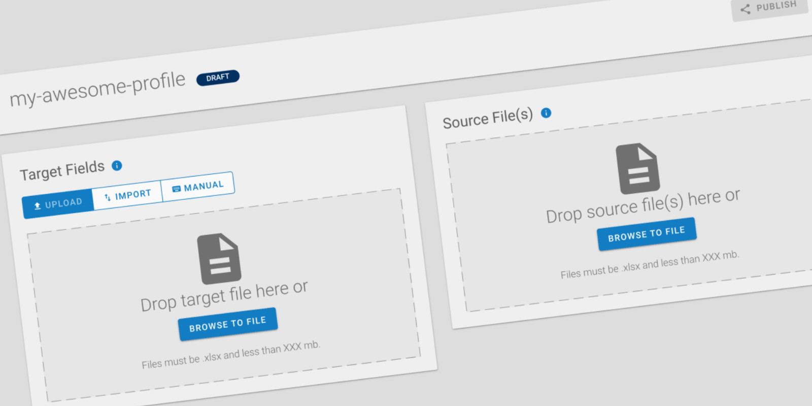
A profile consists of three things: Target Fields, Source Files, and the mapping between them. Target Fields are essentially the column headers for the output file, the shape the data needs to take before it can be uploaded into the legacy system. I worked closely with the Product Owners to write design-agnostic user stories, which meant a lot of time whiteboarding together before anything was built.

The initial mock-ups for creating a profile

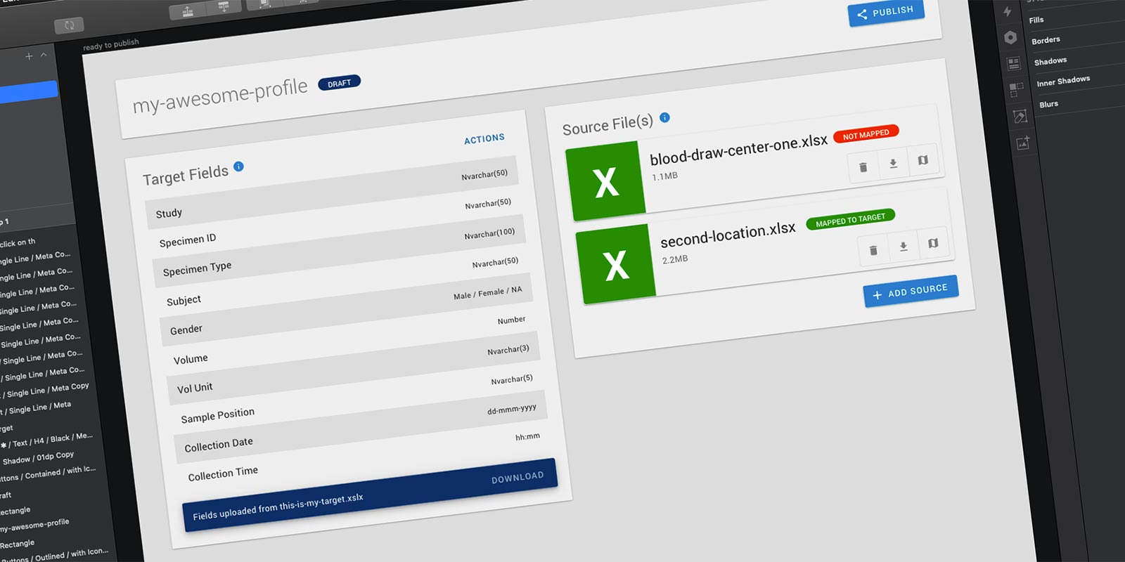
Source Files are the client-provided manifests, the spreadsheets that vary in format from project to project. A profile could have multiple Source Files, and each needed to be mapped to the Target Fields. The output would be a clean, standardized data file ready for the legacy system.

A completed profile
A completed profile, with Target Fields defined and Source Files

The Mapping Step

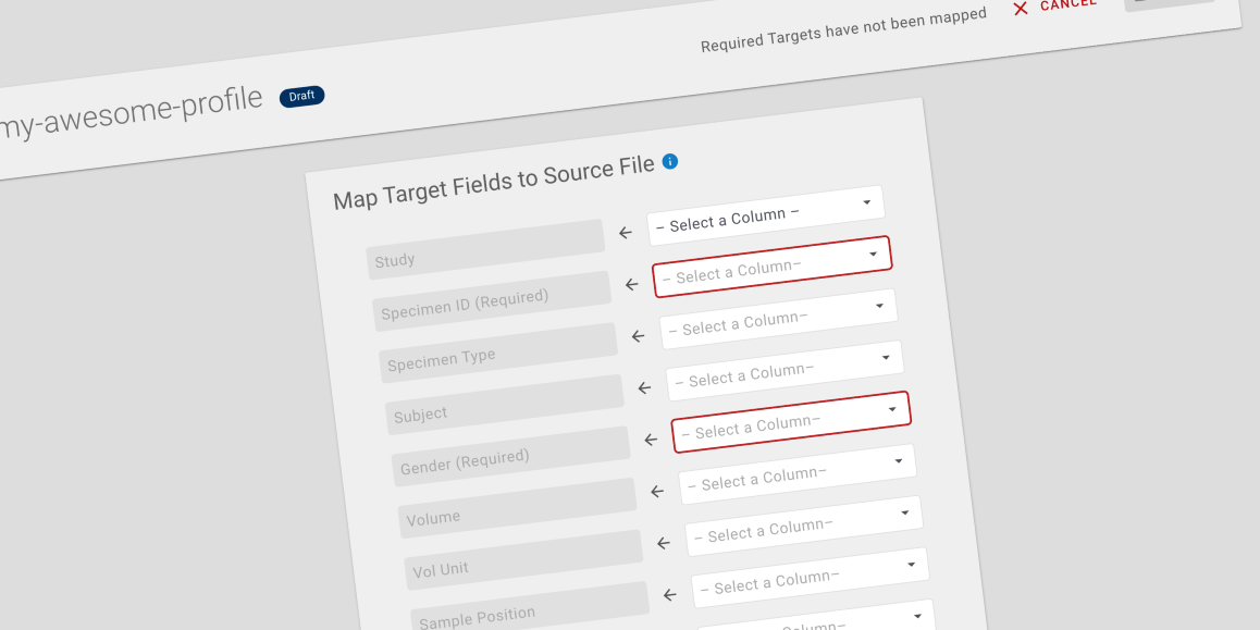
The final step of profile creation was the mapping itself. The system would read the Source File and populate dropdowns with the column headers from the first row of the spreadsheet. Users would then map each source column to the appropriate Target Field. It was the most technically complex part of the workflow and the one that would save Ops Techs the most time.

How users would map files to the Target Fields

The Data Management Module was six months into development when Brooks made the decision to buy rather than build. The company acquired another organization that came with an existing software suite, including a LIMS that solved the same problem P1 was being built to solve.

The research didn’t go to waste. The personas, the insights database, the readout, the workflow maps, all of it documented a complex domain that the organization hadn’t mapped before. That work stood on its own regardless of what got built.

More Case Studies