Online Claims

Online Claims

As SevenCorners’ first UX hire, I pulled this project from the backlog and ran it myself, from the first stakeholder interview to the final tested prototype. Over a year later, I reached out to check in and learned it had cut claims processing from 30–45 days to 5.

Role:
Researcher
Dates:
2016
Client:
SevenCorners

The Challenge

Filing a travel insurance claim meant downloading a paper form, filling it out, and mailing it in. Internally, someone manually keyed it into the system, assigned it to the right department, and queued it for an analyst. If anything was missing, they called or emailed the member and started over. It took weeks, and every step was an opportunity for something to go wrong.

keyboard_arrow_up

Navigating the Industry Tension

Insurance companies don’t like paying claims. That’s not a secret, it’s a business model. I had to account for that reality when defining success. The strategy was to offset any increase in claim volume by eliminating the manual back-end costs that came with processing them. A faster internal process could absorb the cost of a better external experience. That framing gave the business a reason to say yes.

Two Problems, One Solution

The claims process was broken on both sides, members and analysts both suffering from the same manual, paper-heavy workflow. Rather than solve for one side, I framed the project around both from the start: improve the submission experience for members while simultaneously eliminating the manual processing steps that were slowing analysts down. Technology as the buffer, not people.

Setting the Table

Nobody handed me this project. I pulled it out of the backlog because I saw the opportunity. The plan was to interview everyone this process touched, across every department, members, analysts, managers, and the technology team. I’d shadow claims analysts to see the existing workflow firsthand, map the competitive landscape, and document everything into a strategy that could guide the build. The hypothesis was simple: by submitting claims online, processing time would decrease significantly because the current process created too many opportunities for errors and delays. Everything that followed was designed to prove or disprove that theory.
Stakeholder Interviews

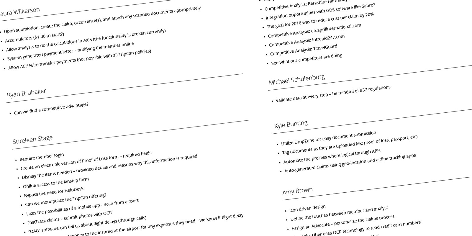
Instead of jumping straight to solutioning, I conducted nine stakeholder interviews across every department this process touched, business, technology, and user-facing. I was gathering requirements and metrics for success, but I was also using the opportunity to evangelize the UX process to a company that hadn’t had a dedicated researcher before. I compiled everything into a single document for everyone to review.

Stakeholder Interview Document

Competitive Analysis

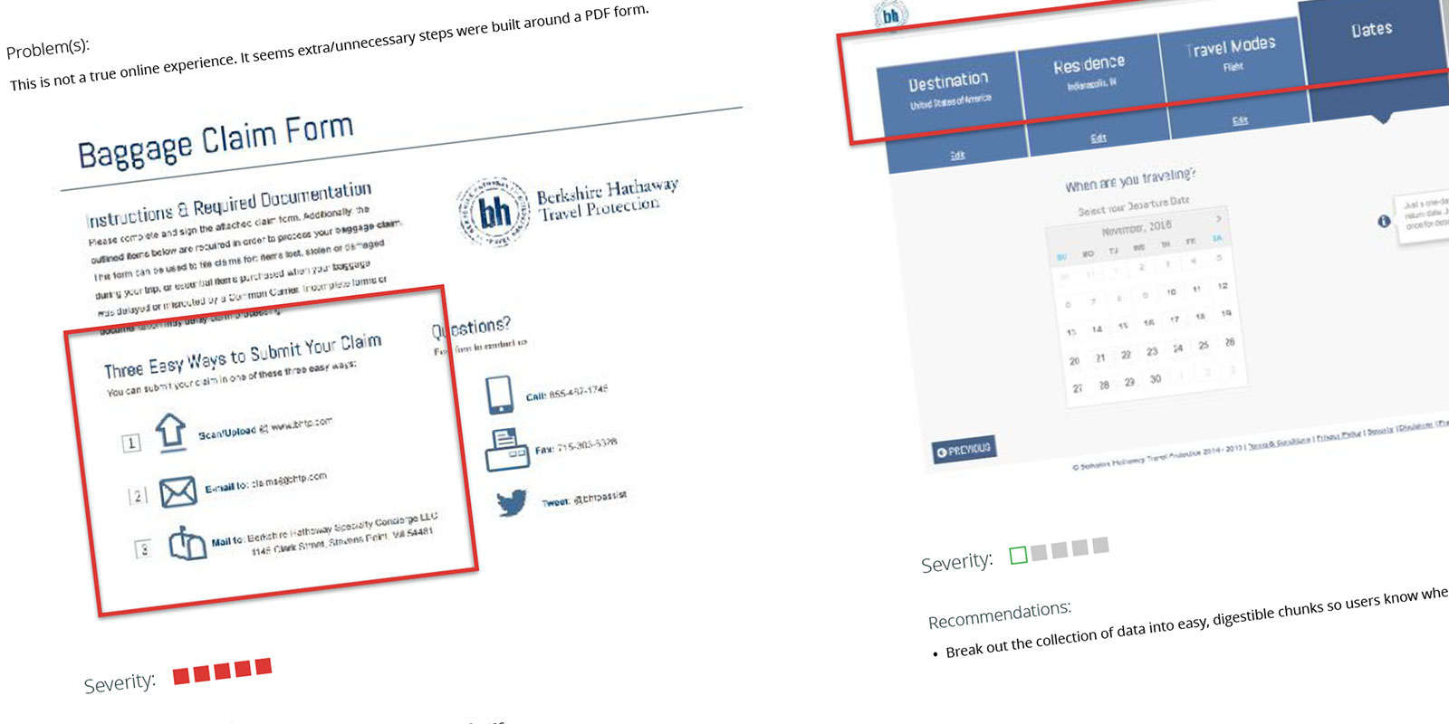
Finding a competitive advantage was a recurring theme from the stakeholders. I took that literally. I purchased policies with two competitors and conducted a heuristic evaluation of both claims processes. One online experience was excellent. The other made me jump through hoops deliberately. Seeing both extremes firsthand gave me a clear picture of what good looked like and what to avoid, and what I had to offset on the business side by making the internal process faster.

Competitive Analysis Document

Journey Mapping

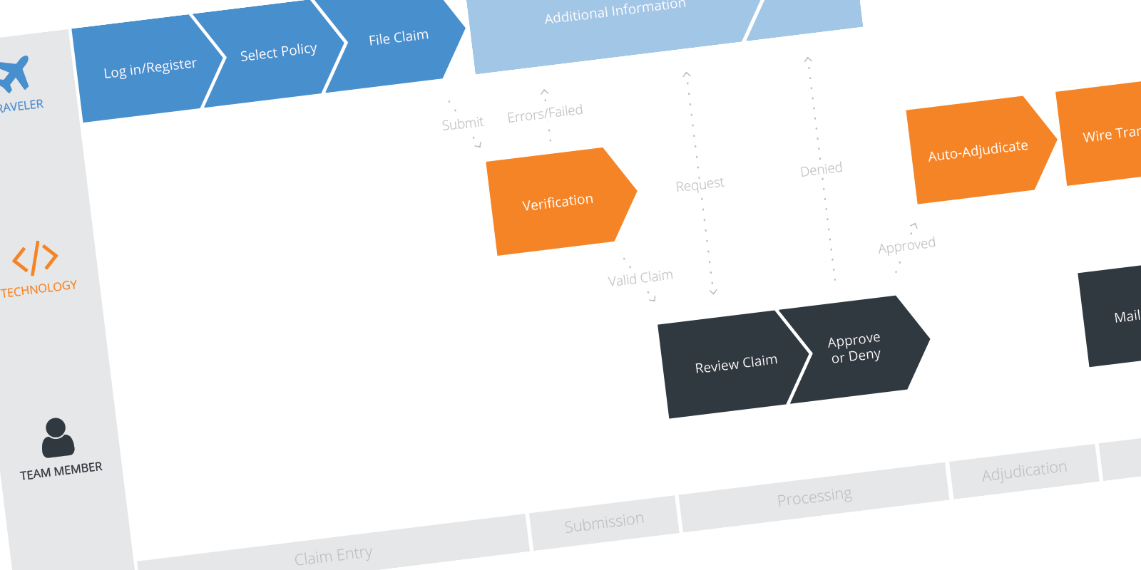
I mapped the existing claims process end to end, every step a member took to file, and every step an analyst took to process. Seeing the full journey in one place made the inefficiencies impossible to ignore and gave me a shared artifact to align stakeholders around.

Journey Map
Journey Map

Strategy Documents

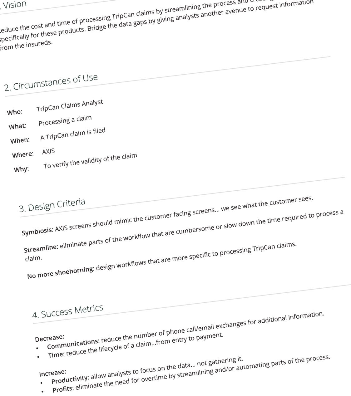
I outlined my objectives and metrics for success in two strategy documents. The main objectives: improve the experience for external members by making claims submission easier, and improve the experience for internal analysts by streamlining processes and bridging data gaps.

Strategy Document
Strategy Document

Data Mapping

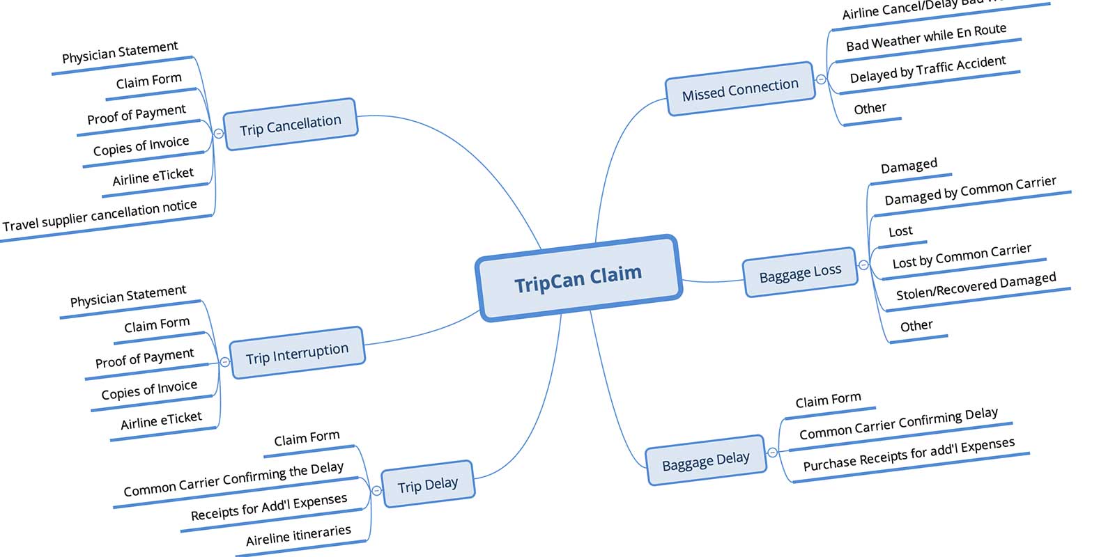
Before exploring layout, I had to understand the data requirements for each claim type. Certain fields are required for certain claims and irrelevant for others. I reverse-engineered the existing paper forms to understand what information was actually necessary, so the new forms could use progressive disclosure to surface only what each situation required.

XMind Document
XMind Document

Low-Fidelity Prototype Testing

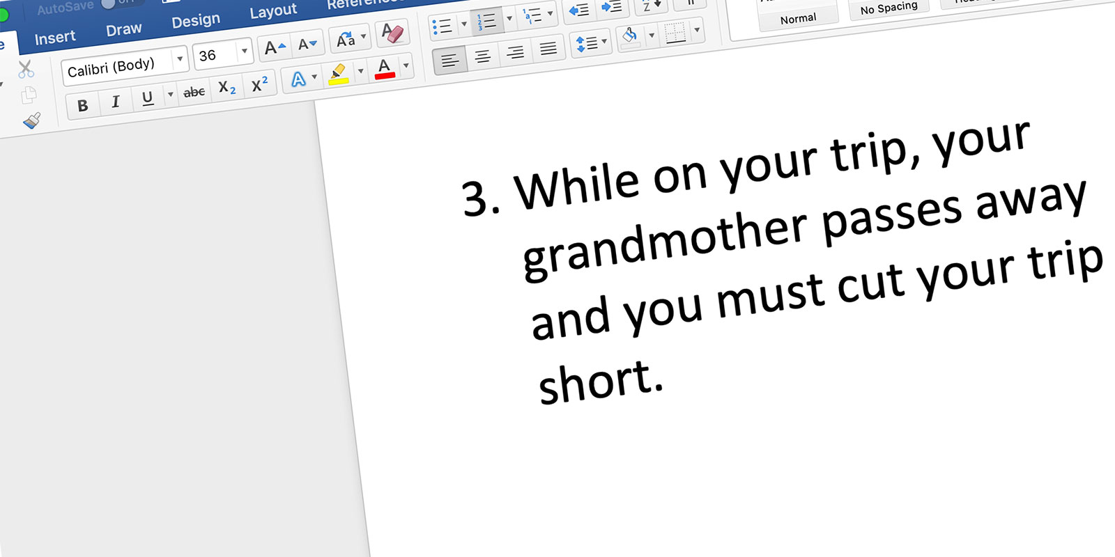
With the data mapped, I built a low-fidelity prototype to validate the approach before committing to a high-fidelity design. I scheduled testing sessions with two internal users: a Claims Analyst who would be receiving and processing submissions, and the manager of the department. I printed the three most commonly filed claim types as scenarios and asked each participant to walk through filing them. Sessions were recorded using Silverback.

During testing I discovered the top three most filed claim types. Watch the session recording.

Usability Testing Session
Watch the usability session.

The feedback was clear enough to move forward with confidence.

Mobile First

The high-fidelity prototype started where the hardest constraint was: mobile. If someone could file a claim from an airport on their phone, the form was simple enough. That constraint drove every layout decision, what to show, what to hide, and when.

Progressive Disclosure

The existing paper forms asked for everything upfront regardless of claim type. The new forms didn’t. By understanding exactly what data each claim type required during the data mapping phase, I could surface only the fields relevant to the situation the member was actually in. Less cognitive load, fewer errors, faster submission.

Designing From Something Familiar

There was no established design system to work from. So I made a deliberate call: the claims experience should look and feel like the member’s own profile page on the marketing website. Something they’d already seen and trusted. A stressed member filing a claim isn’t looking for a new interface to figure out, they’re looking for something that feels like it belongs.

The member profile page on the marketing website

The Result

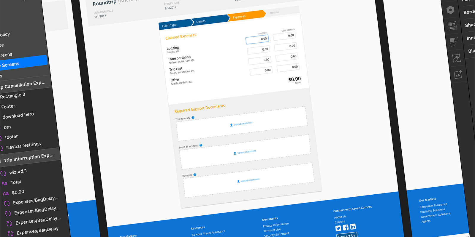
The high-fidelity prototype carried that visual language directly into the claims flow. Same structure, same patterns, same feeling of familiarity, applied to a process that had never felt familiar before.

High-fidelity prototype
The high-fidelity prototype matching the member profile aesthetic

It Shipped

Online claims submission launched in June 2018, over a year after I left SevenCorners.

The Follow-Up

In November 2018 I reached out to the CTO for an update:

“They are reporting that they are processing claims in 1/3 the time, and they are turning online claims around in 5 days, versus 30-45 days for paper/scanned claims.”

More Case Studies