High Risk Queue

Data visualization solved an information hierarchy problem nobody had mapped before. Color-coding every field by how often it appeared across five tabs turned a sprawling Access database into a dashboard hierarchy that let managers make 80% of their decisions from one section.

Role:
Designer
Dates:
2018
Client:
NextGear Capital

The Challenge

The High Risk Queue lived in a five-tab Access database, built by one of the analysts himself because nothing else existed to do the job. It worked for him, but it wasn’t scalable, and NextGear needed it as a real web application any analyst could use to judge a dealer’s risk level quickly.

keyboard_arrow_up

Working With a Team on a Deadline

UX operated as a shared resource across roughly eight dev teams, available if a team wanted it, but not a required part of anyone’s process. This particular team reached out just days before their sprint started, looking for a design.

The Plan

With that little runway, I planned to sit with the High Risk Analysts to understand how they actually made decisions, assess the tools and workflows they were currently using, and design within the constraints of the existing Redline Design System, so the solution wouldn’t need a separate system-level review to move forward.

Shadowing the Analyst

I shadowed the analyst who’d built the original database through his actual workflow, watching what he looked at first and what he ignored across the five tabs.

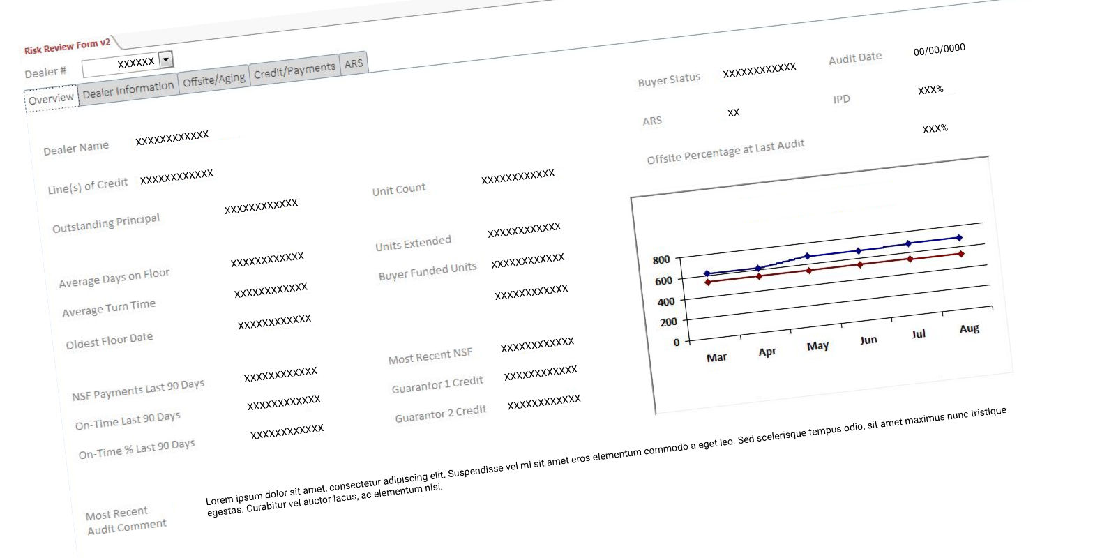
The Access Database
The Access Database being used to determine risk (sensitive data redacted)

Finding the Hierarchy in the Duplication

Documenting every data point revealed the real pattern: fields repeated two, three, four times across different views. That happens when nobody’s designed the information architecture, and users end up rebuilding the same field wherever they need it. I used that repetition to build a new hierarchy, whatever data analysts referenced most often was what mattered most.

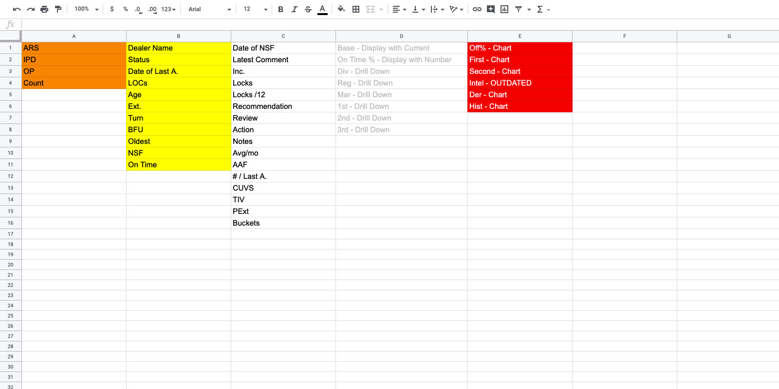
The New Information Hierarchy
I created a new information hierarchy based on the number of times (and how) a field was displayed

The Two Numbers That Mattered

ARS score and Offsite count came out on top, the two data points that actually drove the escalate, consult, or accept decision.

The Layout

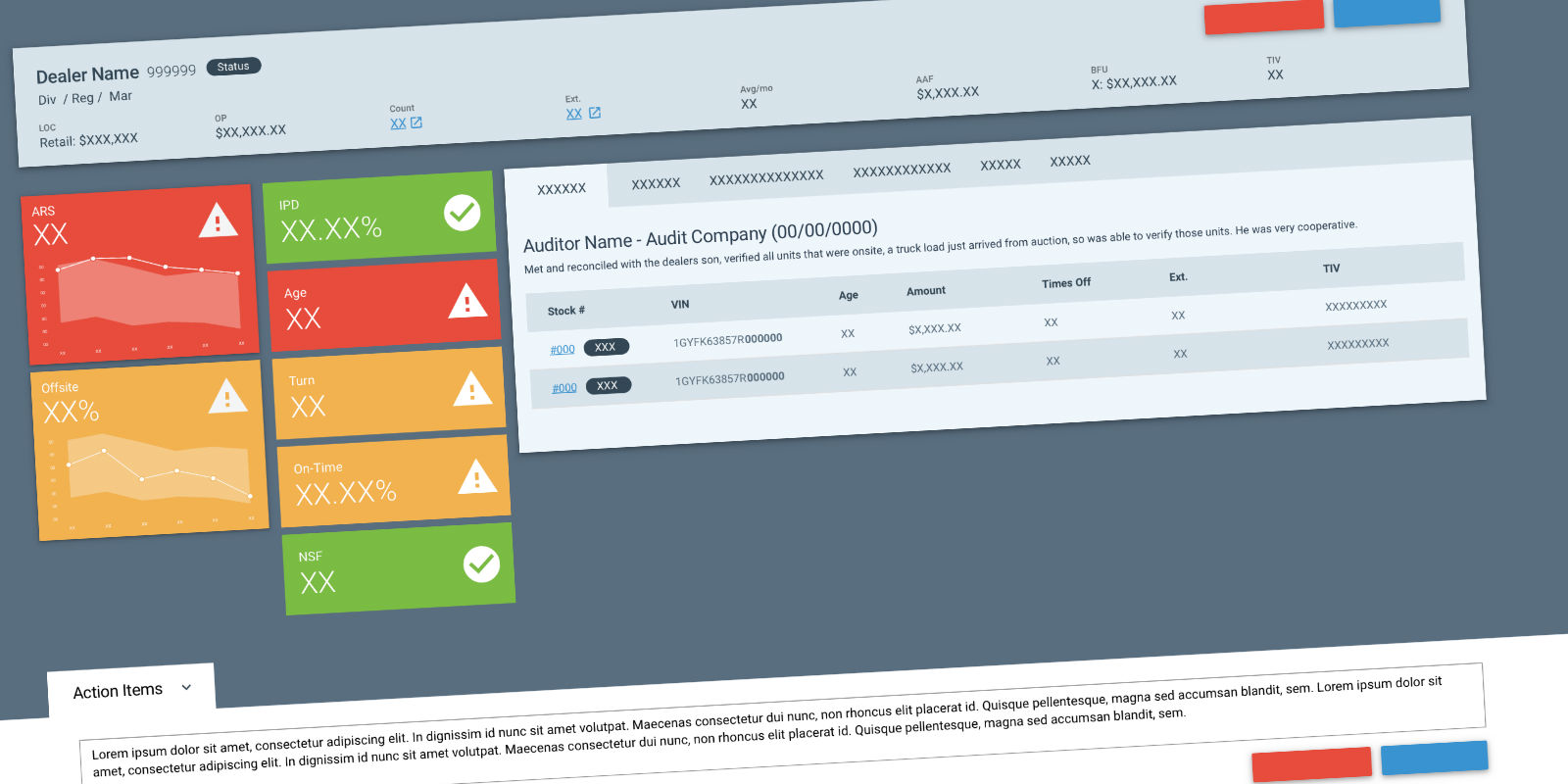
I built the redesign around an F-pattern hero, ARS and Offsite stacked top-left, secondary data filling out the rest, tabs below for analysts who needed to dig deeper.

My Original Design
My initial mock-up for the High Risk Queue

A New Component

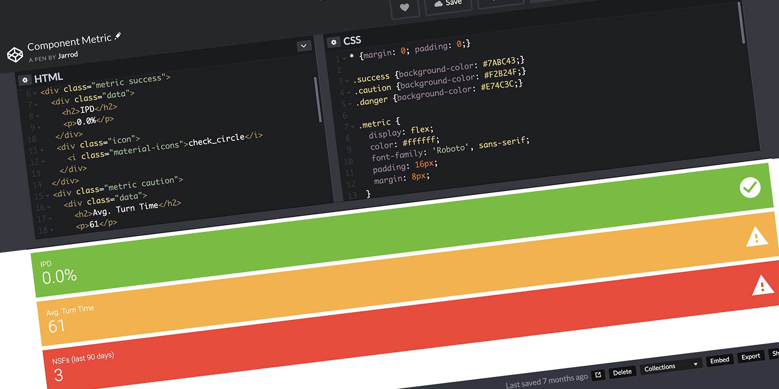
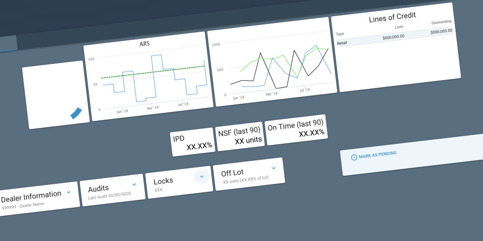
The design system had no way to visualize risk at a glance. I built one myself in CodePen and proposed it as a new addition to the system. Each metric paired its red, yellow, or green state with a checkmark or warning icon, so risk level never depended on color alone.

The CodePen version of the missing Component
This component would need to be built and added to the Design System

Getting a Second Look

I shared the design with the High Risk Analysts’ manager. She responded immediately, pointing to the color-metric bars:

I could make 80% of my decisions with this section right here.

While presenting to the dev team, a gap surfaced. The spec hadn’t accounted for every vehicle needing to be on screen. That reshuffled the layout, and the color-metric logic got pushed to phase two. This case study includes it anyway, since it was part of the validated design.

Development chose to build their own version instead. That’s a normal outcome when UX is an optional resource, I’d handed off my recommendation, and considered my part of the project finished.

It wasn’t until the analysts found the dev team’s version difficult to use that I heard anything more about it. The manager reached back out, her team hadn’t gotten what they needed, and one of the analysts had put together a rough mockup of his own to help make the case for a different approach. Seeing that, the manager asked to bring my original design back into the conversation, telling the team it “gave her butterflies.” Reviewing it together, the room responded to it the way she had.

The solution presented to the team

A Card Sort to Settle It

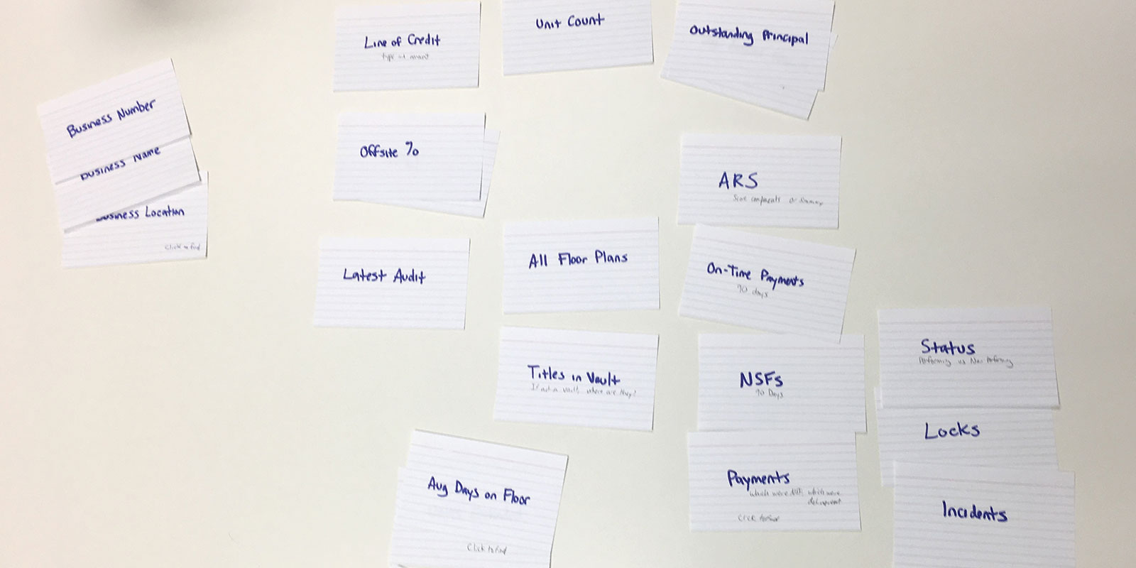
Back on the project, I ran a card sort to let the data settle any remaining prioritization questions, and revised the hierarchy from what it showed.

Card Sorting Exercise
Trying to better understand how Analysts drill down to the info they need

Testing It

Four analysts tested the revised prototype using real historical data. The hierarchy held up.

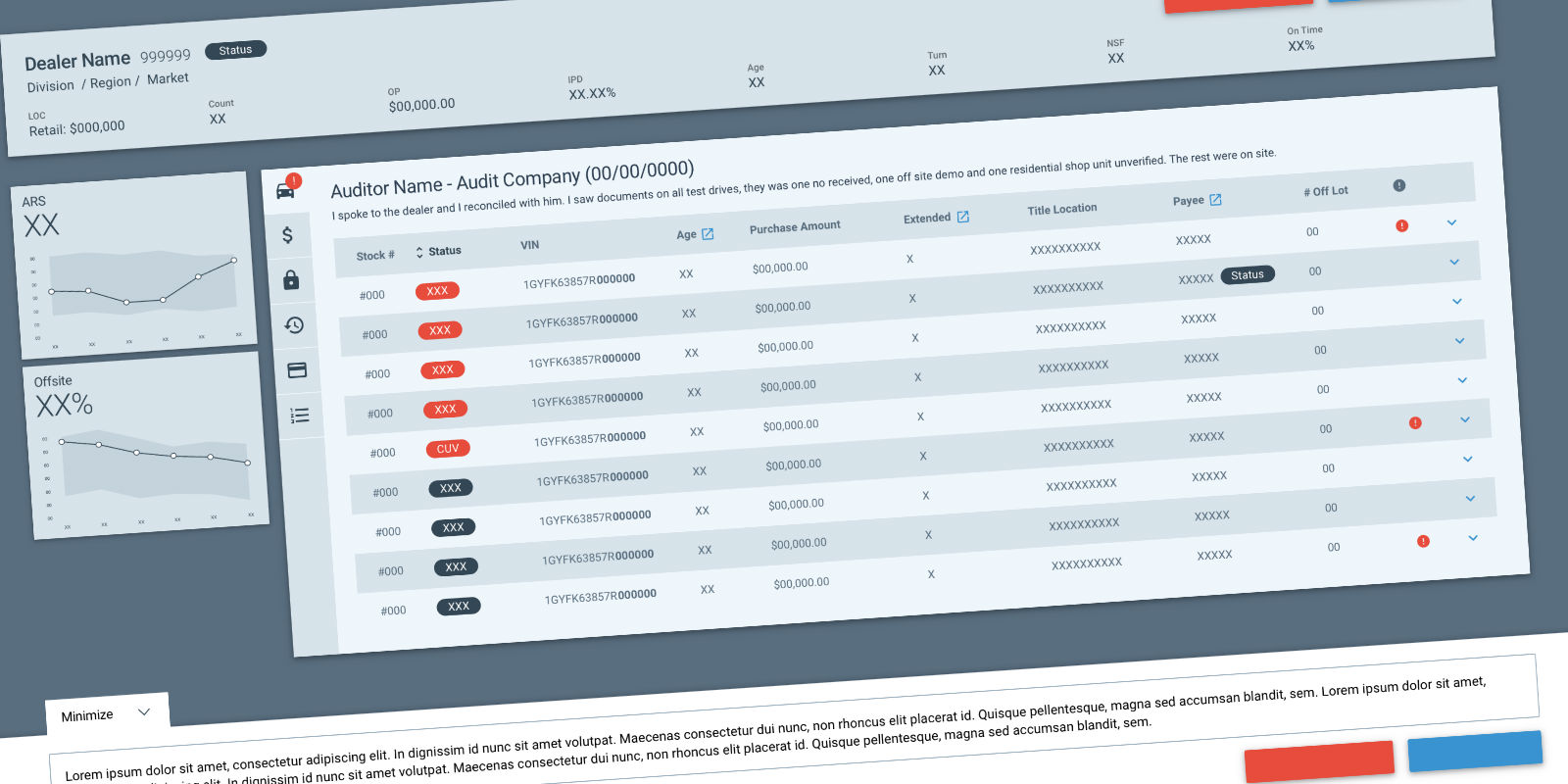
The revised design
The updated design with the additional data points
Validating the design with users

The High Risk Queue was shelved when changes to the department made it obsolete, before the redesign fully shipped. What didn’t change is what that manager recognized from the very first look, the hierarchy worked, because it came from watching how she actually made the decision, not from guessing at it.

More Case Studies