Dinner Meets Tinder

Dinner Meets Tinder

I designed, built, and shipped a full-stack meal-planning app end-to-end, solo, using Claude as a development partner from architecture through deployment. It works, my wife uses it weekly, and she’s already told me the real problem I should’ve solved first.

Role:
Designer Strategist
Dates:
2026
Built For:
Personal

The Challenge

Every week, my wife and I have the same conversation. “What do you want for dinner this week?” “I don’t know, what do you want?” It’s not a big problem. But it’s a persistent one, and the kind of persistent, low-grade friction a product person can’t stop thinking about.

keyboard_arrow_up

Dinner + Tinder

The idea came fast. What if picking meals for the week felt less like a chore and more like scrolling through a dating app? You see something, you swipe. Yes. No. Next. Two people, one app, swipe through meal ideas until you’ve got a week’s worth of dinners, then let the app figure out the grocery list. I called it Dinder. Dinner meets Tinder.

Why Now

Before AI-assisted development, I couldn’t have built this. A full-stack PWA with authentication, a third-party recipe API, real-time ingredient aggregation, and a shopping list that syncs across devices was always a team effort, or it required engineering depth I didn’t have.

AI changed the math. Not because it replaced the thinking, but because it extended what one person with the right thinking could actually ship. I wanted to prove that, and I wanted to walk away with something real to show for it.

Locking Decisions First

Before writing a single line of spec, I ran a structured Q&A process with Claude to lock every product decision. Not wireframes. Not a backlog. Just questions and answers, one decision at a time.

How do two people share the account? What happens when a meal gets dismissed permanently, is that per-user or per-household? When the swipe deck runs out, does it loop or reset? How smart does ingredient combining need to be? Should half a cup of chicken broth from one recipe and two cups from another combine into a single line item on the shopping list?

That process surfaced decisions that would have caused rework mid-build if I’d skipped them. By the time I started writing specifications, the product was already fully defined. The briefs were documenting decisions, not making them.

The Capability Brief

I wrote eight Capability Briefs, structured markdown files that served as the single source of truth for every feature in the app. Each brief covered the problem, the intended outcome, functional rules, edge cases, constraints, and a section written specifically for Claude Code to consume.

AI coding tools are only as good as what you hand them. Feed a vague user story to an AI and you’ll get vague code back. The Capability Brief format was my answer to that problem, structured, explicit, unambiguous. Written for a collaborator that reads everything literally and builds exactly what you describe. Not “users can filter by dietary restrictions,” but exactly which restrictions, how they get passed to the Spoonacular API, what happens when no results come back, and what’s explicitly out of scope. That last part, the not-in-scope list, turned out to be just as important as the feature list. AI builds confidently in whatever direction you point it. A clear boundary is as valuable as a clear requirement.
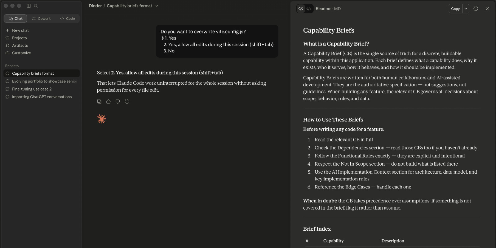
The Capability Brief framework
Working with Claude to define and write the Capability Briefs

I didn’t do formal research here. I built a solution to my own problem, confident I understood it well enough to skip that step. Outcome is where that decision catches up with me.

The Build

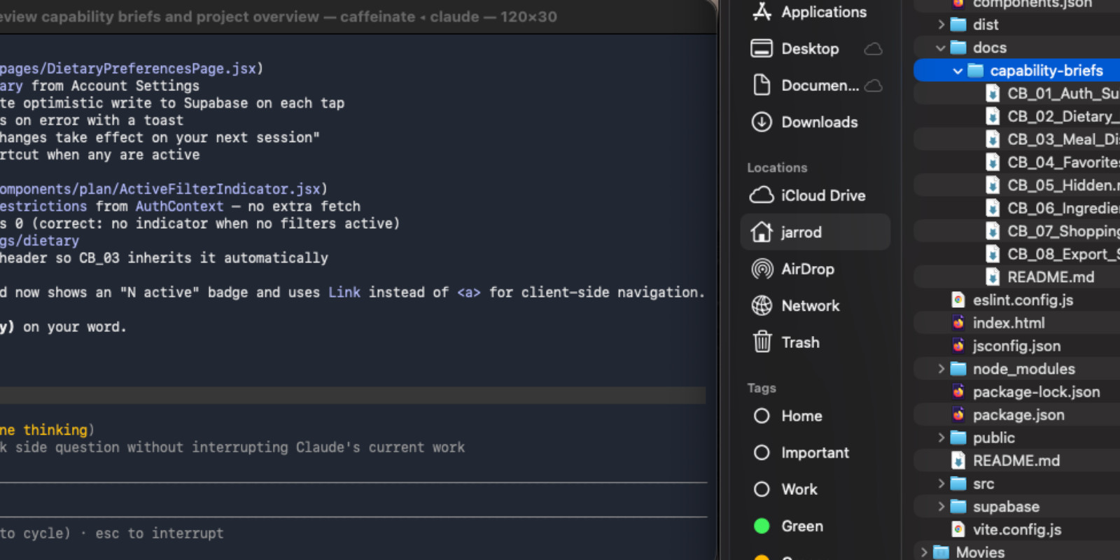
I handed the full set of briefs to Claude Code with one instruction: read everything, confirm your understanding, and ask questions before touching any code. It came back with four clarifying questions. All good ones. We resolved them and started building in dependency order, authentication first, then dietary preferences, then the swipe deck, and so on.

Claude Code working through the briefs

The stack was chosen for documentation and community support. React, Vite, Supabase, Stripe, Spoonacular API, shadcn/ui, Tailwind, react-spring. Every technical decision was made in the briefs before implementation began. Claude Code handled the rest. Honestly, it came together faster than I thought it would.

When AI Hits Its Limit

Once the app was working, I started asking harder questions about the design. Claude Code got me most of the way there, layout, navigation, component structure. The bones were good. The personality wasn’t there yet.

The initial design by Claude
Functional but not very pretty

I decided to compare tools. I gave Figma Make the same brief: here’s the tech stack, here’s what I want to change. Figma Make took more design freedoms than Claude Code did. Where Claude Code built conservatively, Figma Make had opinions about typography, spacing, and color. It was less of a code generator and more of a CSS layer, it made the components look better without restructuring what was already working.

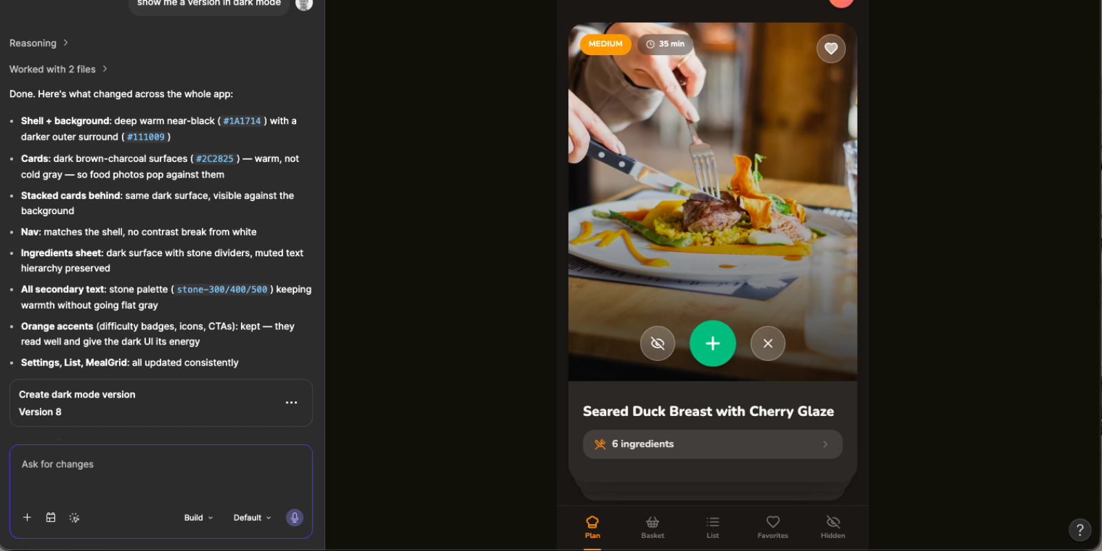
Figma Make takes a turn
I shifted from Claude to Figma to fine tune the design

Neither tool was right or wrong. But neither got it all the way there either. I took what I liked from the Figma exploration and prompted Claude Code to implement the changes. Warmer backgrounds. A more considered color palette with orange and amber as the primary action color. Cards that felt like they belonged in a food app rather than a starter template. The kind of changes that take a working app and make it feel like someone with taste had been involved.

AI is not replacing designers anytime soon. What it is doing is handling everything else, so designers can spend their time on the decisions that actually require taste.

The Logo

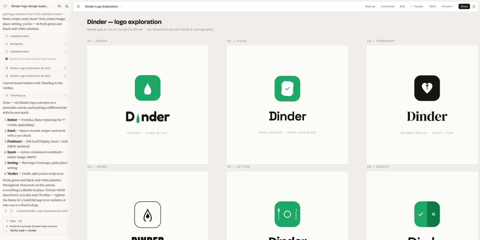
It wasn’t until the app was ready to deploy that I turned my attention to the logo. I asked Claude Code to generate concepts. Six attempts. None of them were good.

Bad logo concepts from Claude
Claude Design won’t be replacing people anytime soon

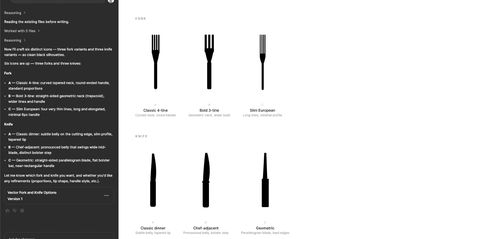
I tried Figma Make for icon design. Also not good.

Figma Make attempts logos
Figma Make struggles to make basic shapes

I designed the Dinder logo myself, dropped it in, and suddenly it felt like a real product.

It Ships

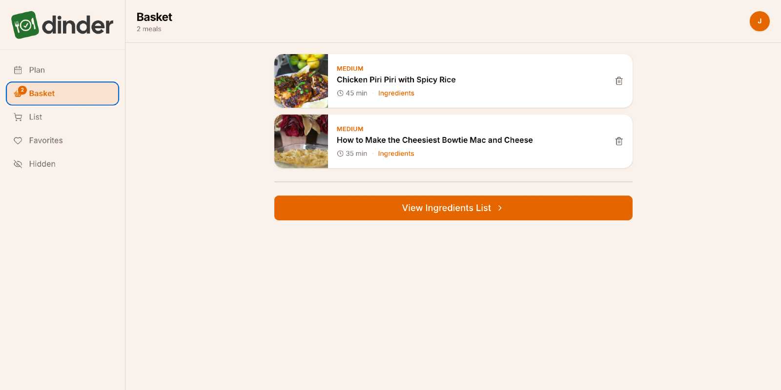
The app is live at app.jarrodmurray.com. Google authentication, real recipe data from Spoonacular, smart ingredient aggregation, a persistent shopping list, and a share sheet that works on any device. Built by one person, with AI, from a blank repo to a deployed application.

Some things didn’t make it. Sending the grocery list directly to a shopping cart required paid API integrations that weren’t worth pursuing for a learning project. Facebook SSO got cut. The AI-powered Premium tier, meal suggestions based on swipe history, condition-aware filtering, natural language meal planning, is designed and documented but waiting for a reason to invest in the infrastructure.

Knowing when to stop is a product decision. The core loop works. The app is genuinely useful. The methodology is proven.

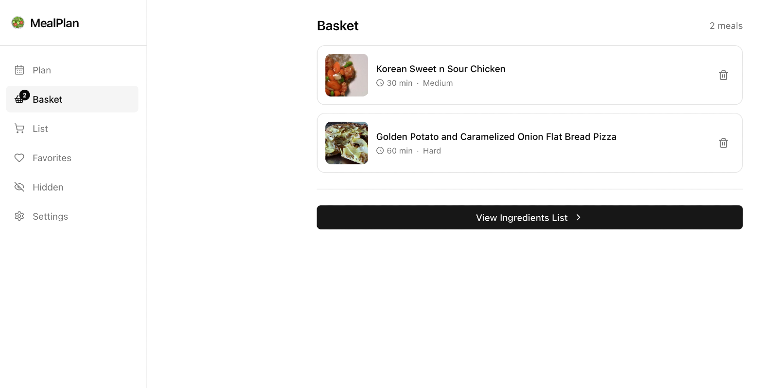
The final v1 app
Logo replaced the placeholder to give it a finished look

My Problem and Her Problem

I built Dinder to solve my problem. I knew it intimately, I lived it every week. What I skipped was sitting down with my wife before I built anything and asking her what she actually needed. I just built. And v1 works. It solves the weekly decision problem for me every time I open it.

But a working app has a way of surfacing the problems you didn’t know to ask about.

What She Actually Wants

My wife used it. She had thoughts.

Dinder shows her meals she’s never seen before. That part she likes. But her version of “what should we make this week?” is more layered than mine. She has close to 200 recipes pinned on Pinterest, things she’s already decided she wants to make someday. Meals she’s cooked before that everyone loved. Ideas she’s been quietly collecting for months. Dinder doesn’t know any of that exists. It’s pulling from a recipe API while her actual list of “yes, that” sits untouched in another app entirely.

That’s the real problem. And it’s a better one than the one I solved.

What’s Next

My product mind went straight to it: what if I could pull her pinned recipes directly into Dinder? Paste a Pinterest board URL, parse the recipes, inject them into the swipe deck alongside the Spoonacular results. Her existing list, finally connected to the weekly planning process.

I don’t know yet if that’s technically possible. But I know how I’d start figuring it out, a Q&A session with Claude, a new Capability Brief, and the same process that got v1 out the door. That’s what v2 looks like.

Meal planning is still the lowlight of my wife’s week. That’s the real success metric. I haven’t hit it yet. But I’m closer than I was, and now I know exactly what to build next.

More Case Studies