Dinder V2

Dinder V2

V1 solved the “what’s for dinner” problem. V2 turned Dinder into a multi-source, AI-assisted grocery platform, and meal planning became a family event instead of something that fell on my wife every week.

Role:
Designer Strategist
Dates:
2026
Client:
Personal / Independent

The Challenge

V1 shipped. The weekly dinner debate stopped. But my wife had 2,000 Pinterest recipes Dinder couldn’t touch, and that was the real problem left to solve. Everything else that followed was me asking a different question: how far could I take this?

keyboard_arrow_up

Getting Her Recipes Into Dinder

The Pinterest API approval process runs one to two weeks, with no guarantee at the end. I wasn’t going to sit idle waiting for approval that may not come. I needed Dinder to work with her recipes whether Pinterest said yes or not, so I started designing for both outcomes at the same time.

The immediate move was URL paste. At minimum, it gave those 2,000 recipes an entry point into the app. She could paste a Pinterest recipe link directly into Dinder, the app would extract the ingredients, and it would land in her shopping list. Not elegant for 2,000 pins, but it meant the Pinterest integration wasn’t load-bearing. If approval never came, the feature still worked.

While that shipped, I started figuring out how to get her boards in at scale. I’d already connected Airtable to Claude on another project, so it was the natural starting point. Google Sheets was considered but would have required its own approval process, which defeated the point. I tried a few scrapers before finding one that worked. Titles, images, board names, and pin URLs, all extracted and uploaded to Airtable. She has over 20 boards, some organized by appliance, some by category, and one called “Yummy” that’s basically everything else. Over 2,000 pins across all of them.

The first export didn’t include destination URLs, just Pinterest pin URLs. Without the recipe URL there was nothing to extract ingredients from. But Pinterest pin URLs redirect to the source recipe page when followed. Dinder could follow that redirect server-side and land on the actual recipe. The data I needed was already in what I had.

Pinterest eventually approved the app. I moved from the Vercel subdomain to app.jarrodmurray.com, which Pinterest wanted anyway, a registered domain tied to a real entity with a live privacy policy. Both the Airtable integration and the URL paste stayed in the product. The approval unlocked a cleaner path, but the app didn’t need it to work.

From Meal Planner to Grocery Platform

With her recipes in the app, I started a discovery conversation with Claude about how groceries actually work in our household. Not just meal ingredients, the whole weekly shop. What came out of that conversation reframed everything: staples dominate our list. Bread, milk, eggs, things we buy every week regardless of what’s for dinner. Recipe ingredients are maybe 30% of what we actually purchase. Dinder was solving a fraction of the problem.

The bigger opportunity was getting everything into one place and pushing it directly into a cart. I researched what was actually available. Instacart was the clearest fit but ran a 30-40 day approval process. Walmart had no public API. Kroger’s Cart API was developer-friendly but required a Kroger account. Another approval process, another dependency, another wait. I’d just been through that with Pinterest. I wasn’t doing it again.

So I designed something custom. The first layer was named lists: a place to codify the staples we buy every week by store. Aldi gets our primary shop. Meijer covers whatever Aldi doesn’t carry or runs out of. The lists surface alongside meal ingredients when it’s time to generate the shopping list. One consolidated list instead of a mental one running alongside the app.

The second layer was getting that list into an actual cart. Aldi doesn’t have a public API, but their app has a “Buy It Again” tab, everything the household has purchased before, known brands, known sizes, already approved with our wallets. I brought that to Claude and it immediately recognized what it changed: the agent doesn’t need to guess. It checks purchase history first, uses it if there’s a match, and only flags something for review if nothing matches.

The key architectural decision was keeping the logic in code, not tokens. Navigation, search, adding to cart, all of that is deterministic, handled by code. AI makes exactly one call per ingredient: given these search results, which product is the right match? That’s it. The agent doesn’t decide which button to click. It doesn’t interpret the page. It answers one bounded question and code does the rest. When I’m ready to shop, Dinder generates a structured prompt, I paste it into the Claude in Chrome extension, the agent works through “Buy It Again,” builds the cart, and flags anything it can’t match. I review and submit. The repetitive part is handled. The judgment stays mine. The friction is gone.
Research Is the Brief

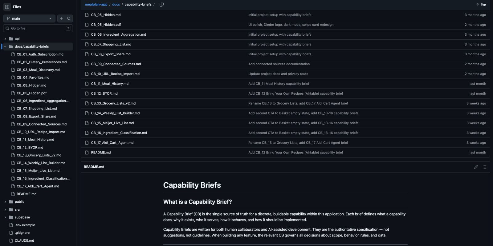
Six Capability Briefs written post-launch. Each one the result of a structured discovery conversation that mapped business rules, defined scope, identified edge cases, and documented explicit workarounds before any code was written. Six briefs is the equivalent of 60-100 traditional user stories.

The six Capability Briefs
Six Capability Briefs written post-launch, each one a structured discovery conversation before any code was written

Take the Aldi Cart Agent. Before a single line was written, the research answered questions like: what happens when an item isn’t in “Buy It Again”? What if Aldi is out of stock? Which decisions belong to the agent and which belong to code? What’s explicitly out of scope for this version? The brief didn’t just describe the feature. It defined exactly how it behaved under every condition we could anticipate, and drew a hard line around what it wouldn’t try to do.

The same process shaped the grocery list architecture. Staples dominate our weekly shop, recipe ingredients are maybe 30% of what actually gets purchased. That single finding, surfaced through a discovery conversation, changed the entire feature scope. Named lists weren’t a nice-to-have. They were the product decision that made the shopping list actually complete.

That’s what research looks like when the product is live. Not surveys or usability sessions. Rigorous scoping conversations that produce artifacts specific enough to build from, and honest enough to know what to leave out.

A New Coat of Paint

The color palette Figma Make selected for v1 leaned orange. It was functional, but the more I used the app the more it didn’t feel right. I switched the primary action color to the Dinder logo green, already established in the brand, and moved the backgrounds to dark blue-grays. A deliberate aesthetic decision, nothing more.

The original orange palette
The original orange palette selected by Figma Make

Connecting Airtable

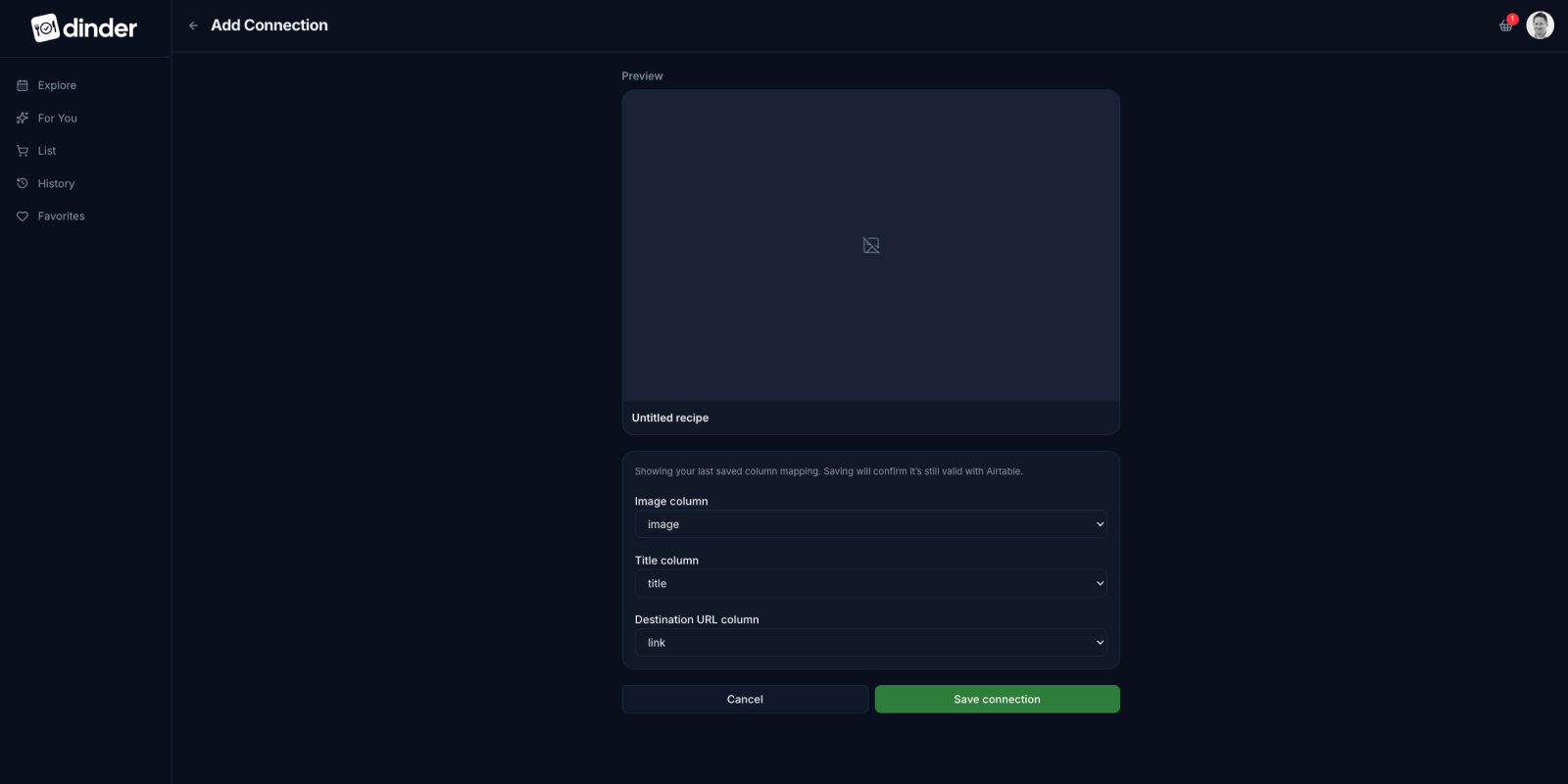
Getting Airtable recipes into the swipe deck required a design decision before a UI decision. Her Airtable base had its own column names. Anyone else’s would too. Rather than hardcode an assumption about what those columns were called, I built a mapping screen: the user selects which column maps to image, title, and destination URL, and a live preview renders the card before anything gets saved. The flexibility was intentional. It means the feature works for any Airtable structure, not just mine.

The Airtable column mapping screen
The Airtable connection screen lets users map their own column names to the card fields

The For You Tab

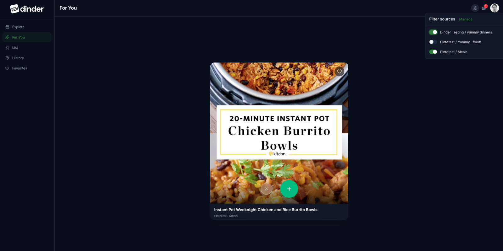
The For You tab is the swipe deck for connected sources. Pinterest boards, Airtable collections, anything linked to the account populates here. With 20+ boards in play, the user needed control over what was actually showing. A filter lets you toggle sources on and off, so if she’s only looking for dessert ideas she can surface that board and nothing else.

Board-level source filtering
Board-level source filtering on the For You tab

Claude built the filter as a bottom sheet. I had it moved to a menu item and changed the checkboxes to toggles. Small calls, but they matter on a mobile screen. Toggles communicate state at a glance. A menu item is where you’d look for it. Neither change required a conversation. Both made it better.

Connected Sources

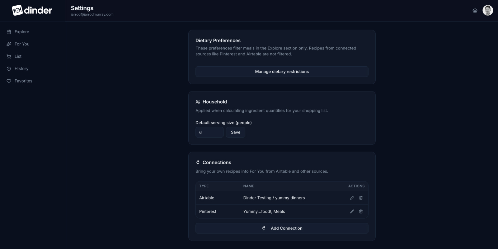
Connected sources in Settings
Pinterest and Airtable connected as sources in Settings

Managing connected sources lives in Settings. Pinterest and Airtable appear as distinct connections, each toggleable independently. The design keeps source management separate from the swipe experience so the For You tab stays focused on one job: surfacing meals.

The Shopping List

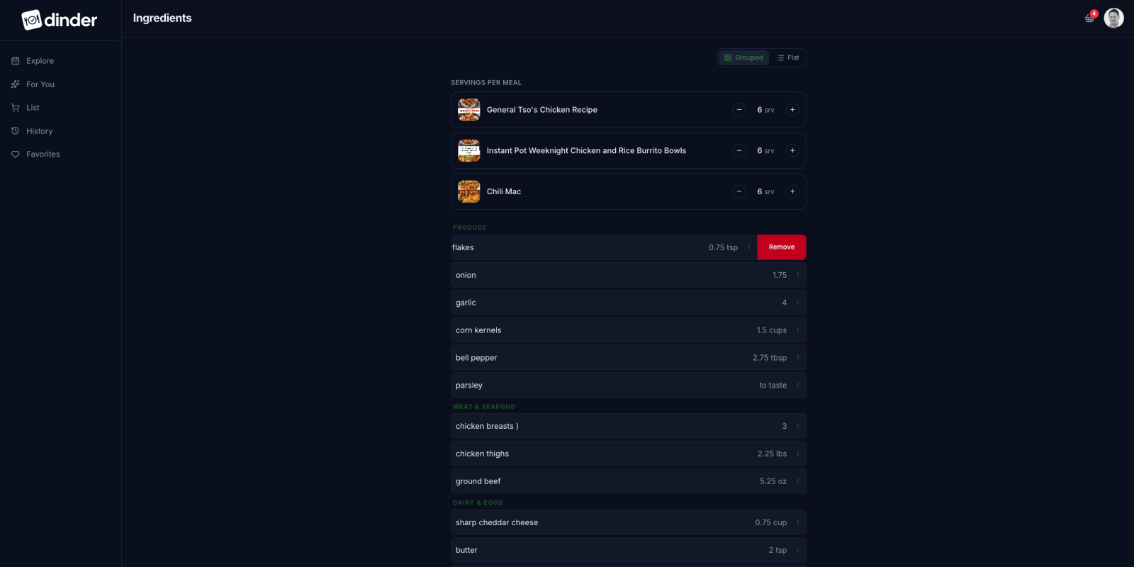
The shopping list is where everything converges. Meal ingredients aggregated and categorized, staples surfaced from named lists, all of it in one place. “Add from saved list” sits above the items so it’s reachable without scrolling. The list is organized by category, produce, meat, dairy, because that’s how a store is organized. A small decision that makes the list actually useful to shop from.

The categorized Shopping List
The Shopping List with categorized ingredients and saved list integration

History and Favorites

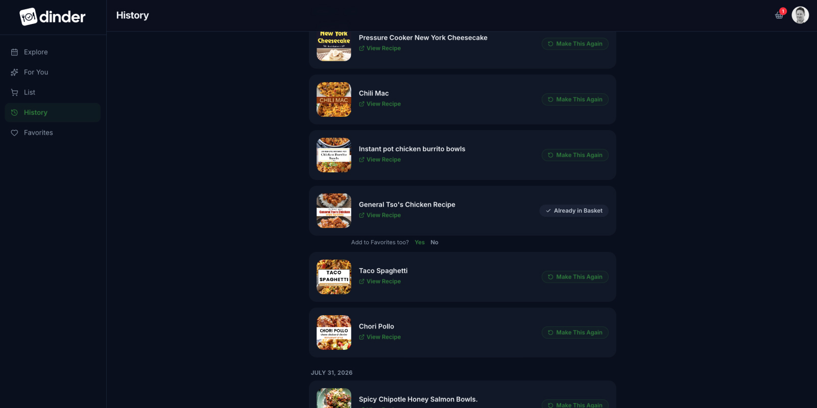
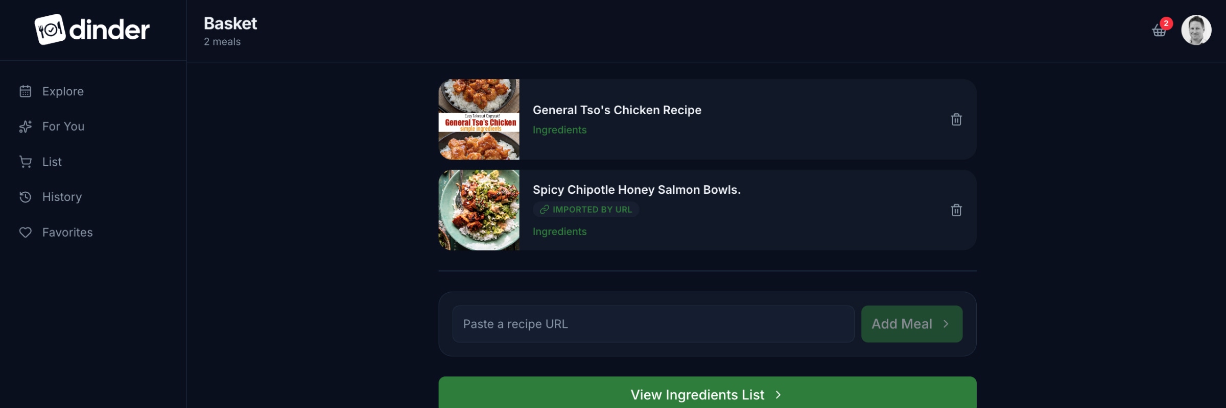
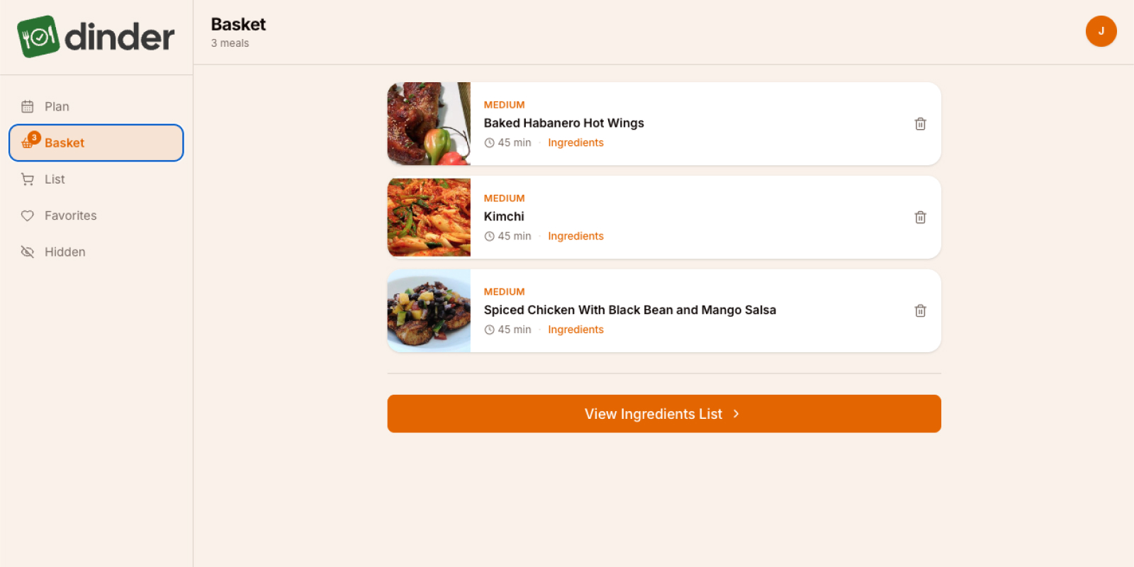
When a meal gets added to the shopping list, Dinder knows it was chosen. It logs it automatically to a History tab, no action required. Instead of waiting for a meal to surface again through the deck, the user has a dedicated place to find everything the household has made before. One tap to add it back to the basket.

The History tab
The History tab with the Add to Favorites prompt

Make a meal a second time and Dinder notices. A quiet prompt appears under the card: “Add to Favorites too?” It doesn’t interrupt anything. It doesn’t require a decision in the moment. It just makes the offer and waits. Favorites is for the meals the household has already approved twice. History is for everything they’ve made. The distinction matters and the app knows the difference.

Sending the Cart

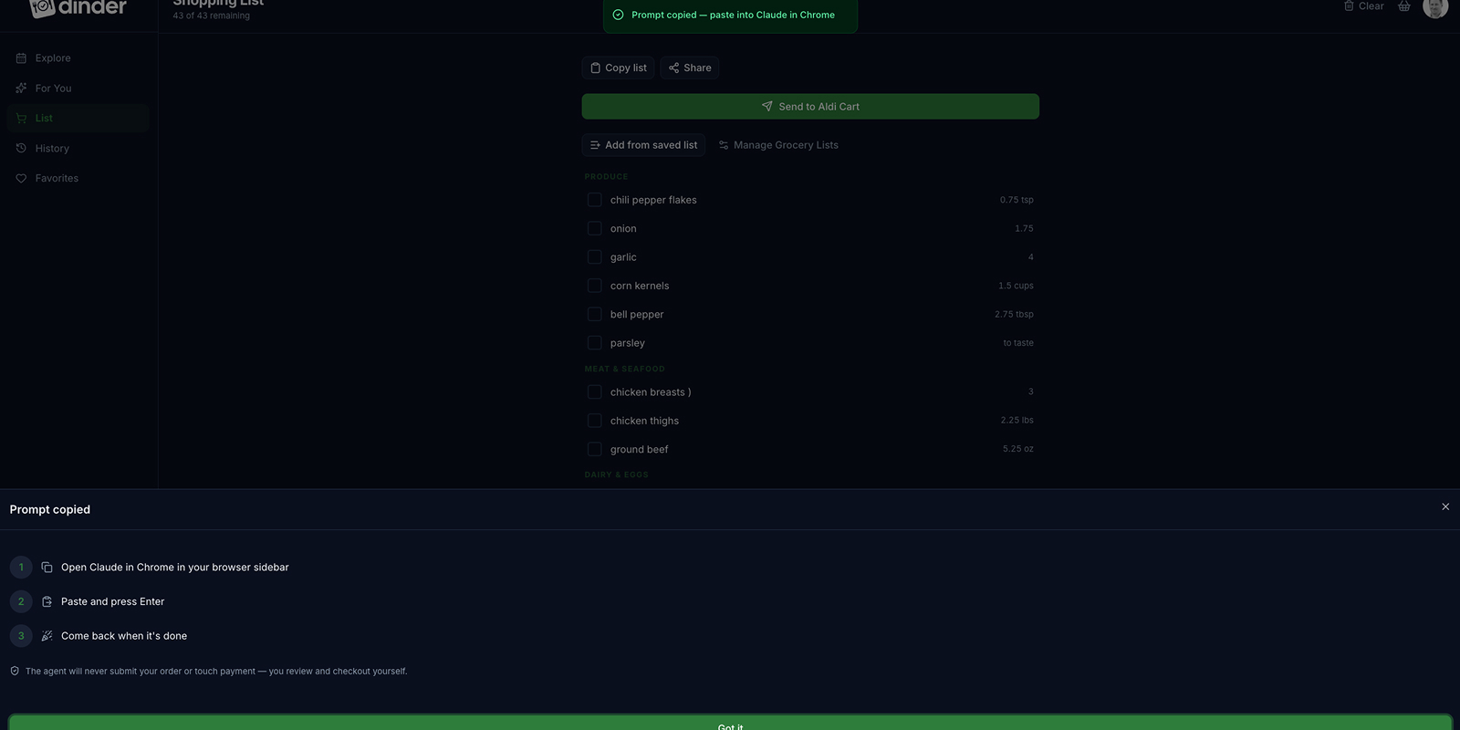
The “Send to Aldi Cart” button is the most consequential tap in the app. The design problem wasn’t the button. It was trust.

The prompt modal with instructions
The prompt modal with three-step instructions and trust copy

Tapping it copies a structured prompt to the clipboard. The modal that follows tells you exactly what to do with it: open Claude in Chrome, paste and press Enter, come back when it’s done. The agent builds the cart. The user reviews and submits. “The agent will never submit your order or touch payment, you review and checkout yourself.” One sentence. Necessary every time someone uses it for the first time.

The Meijer live list, items Aldi couldn’t fulfill automatically routing to a secondary cart, is specced and documented. It’s not built yet. Knowing when to draw the line on scope is a design decision too.

Meal planning is no longer my wife’s problem to solve alone. One night I mirrored my phone to the TV and let my oldest pick the meals for the week. The whole family had a say in what got made. That wasn’t the feature I set out to build. It’s better than the feature I set out to build.

The Aldi Cart Agent works. I’ve tested it, it does what it’s supposed to do, and the logic holds up. It’s not part of the weekly routine yet, partly because it only runs from a desktop and we mostly shop from our phones. That’s the next friction to solve.

Pinterest is wired up and that’s where her recipes live. With a direct integration working, Airtable turned out to be a bridge we no longer need. The grocery list still gets manually entered into a cart more often than I’d like, but the hoops and cost required to automate that fully aren’t worth it yet.

V2 didn’t finish the product. It moved the ceiling. The app that started as a meal randomizer for two people became something the whole family uses, built entirely through structured conversations, Capability Briefs, and a process that kept the logic in code and the decisions with the people making dinner.

More Case Studies