Know Your Audience

A hackathon idea to an 84, “Excellent,” SUS score in one month… I designed every fidelity, ran every usability session, synthesized every finding, and rebuilt the prototype myself, solo, with none of today’s AI tools to lean on.

Role:
Designer
Dates:
2021
Client:
Driven Data

The Challenge

Delivering 1st-party audiences to Facebook and Google was identified as an opportunity to increase revenue. As an organization, we needed to solve how we productize this new SaaS offering and get it to market quickly.

keyboard_arrow_up

Starting Before the Story

The hackathon gave me an entry point before I had a user story to work from. Engineering needed something to react to, so I built in Whimsical. It was my first time using the tool, and that was intentional. Low commitment, just enough detail to start a conversation.

Finding the Right Pattern

The hackathon surfaced the right direction. Audiences weren’t going to live on a shared tab, they’d be accessed per channel, contextual to where the audience was being delivered. I’d already designed a pattern for onboarding that followed the same logic: dealership, then digital channel, then open for configuration. The drawer was already in my files. I had the structure, I just needed to apply it to a new problem.

Getting Buy-In

I presented the direction at the Product Workshop on January 11th. Product and Engineering aligned on the approach, and I had what I needed to move forward.

Scoping the Work

The user story I was handed described a single feature. The more I worked through it, the clearer it became that the scope was bigger than one story suggested. Users needed to navigate to a client’s audiences, edit parameters, see the impact of those changes, and understand when they’d take effect. That’s four distinct things to validate, and none of it existed yet. Users would be seeing this functionality for the first time.

I decided to start in low fidelity to test my assumptions before committing to anything.

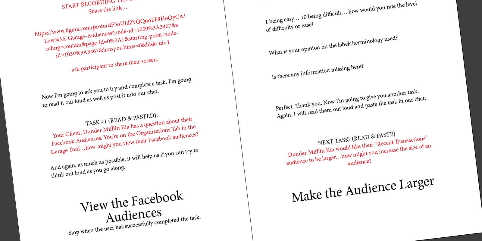
Low fidelity validation script
I write my scripts in Adobe InDesign

Round One: The Low Fidelity Sessions

I split the requirements into two tasks: how might you view a Facebook audience, and how might you increase the size of one. I scheduled five participants for January 24–25, 2022, and ran the sessions against the low-fi prototype.

Testing the low fidelity prototype

The concept held up. Participants understood the workflow and could complete both tasks. But I noticed something: the lower fidelity was creating friction of its own. This was brand new functionality, nothing familiar to anchor to, and the prototype’s rough edges were adding noise to what I was trying to learn.

Two things stood out as design problems I could act on. The settings cog wasn’t obvious enough as the menu entry point. And the chips in the hero, intended as informational labels, had all five participants trying to click them as if they were buttons.

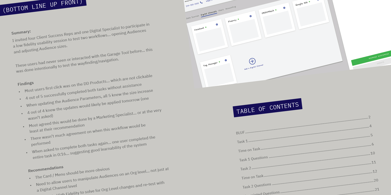
Low fidelity findings readout

I compiled everything into a readout documentlaunch and presented the findings on February 1st.

Round Two: The High Fidelity Sessions

My hypothesis going into the high fidelity sessions was that a higher fidelity would remove the noise and let the design stand on its own. I addressed both pain points in the redesign, then rebuilt the prototype in high fidelity. I combined the two tasks into one and ran five more sessions February 8–9.

Testing the high fidelity prototype

The difference was immediate. Participants moved through the workflow with noticeably more speed and confidence. The things that had slowed people down in the low fidelity sessions weren’t slowing them down anymore.

Starting in Whimsical

With very little to go on before the hackathon, I opted for the lowest possible commitment. Whimsical was new to me, and exactly the right tool for that moment, just enough fidelity to get a reaction.

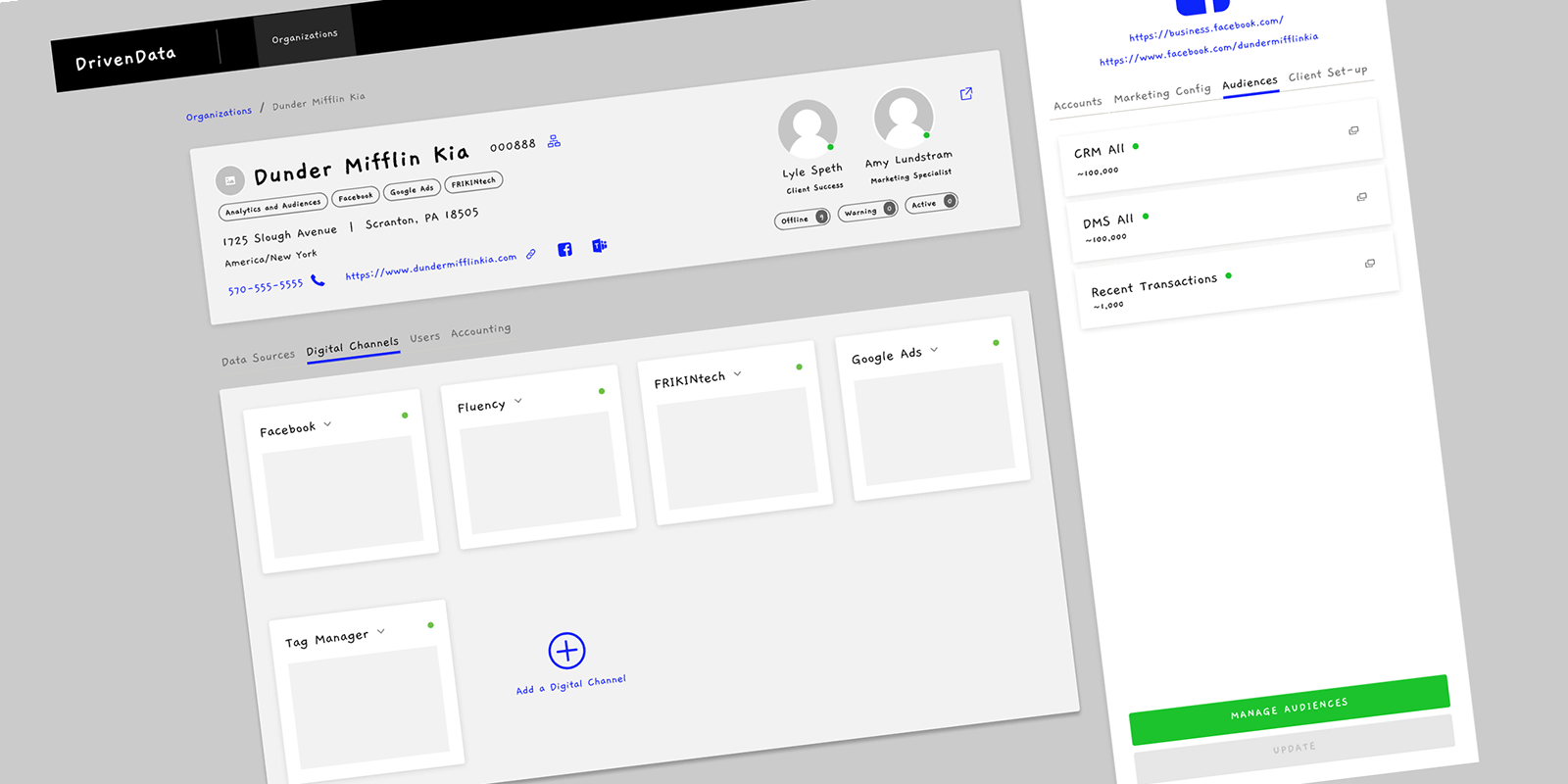
Low fidelity mock-up in Whimsical
Using Whimsical to create low fidelity mock-ups

The Drawer Concept

After the hackathon shifted the direction, the key decision was where audiences would live in the UI. I chose a drawer over a tab or a modal. A tab would have buried audiences in a flat list with no channel context. A modal would have interrupted the workflow. A drawer keeps the user in context of the channel they’re already looking at, opening inline without pulling them somewhere else. It’s a pattern I’ve returned to throughout my career because it works, it’s mobile-friendly, it keeps the screen clear of clutter, and it lets users drill down and focus without losing their place.

Low fidelity design for audiences
Concept: Digital Channel-specific audiences open in a drawer

Building the Prototype

Moving into Figma for the first time after years in Sketch, I noticed immediately how much more representational the prototypes were. Hover states, animations, transitions. That mattered here because participants were going to be seeing this application for the first time, not just this feature. The product and engineering team were still actively scoping and building it. Everything in front of them was going to be new. The more the prototype felt like something real, the more I could trust what I was learning from it.

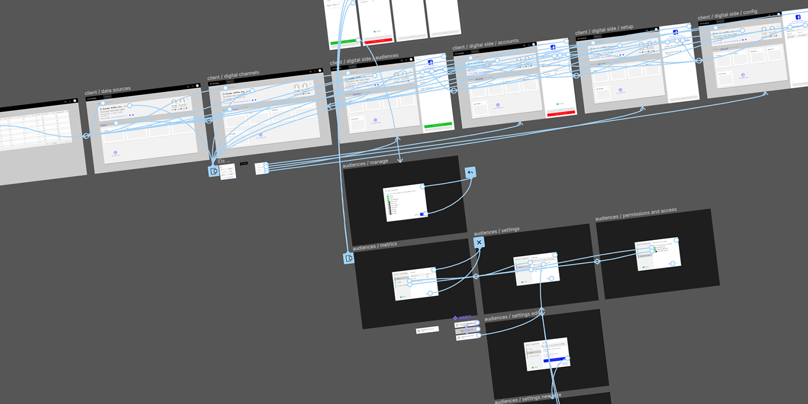
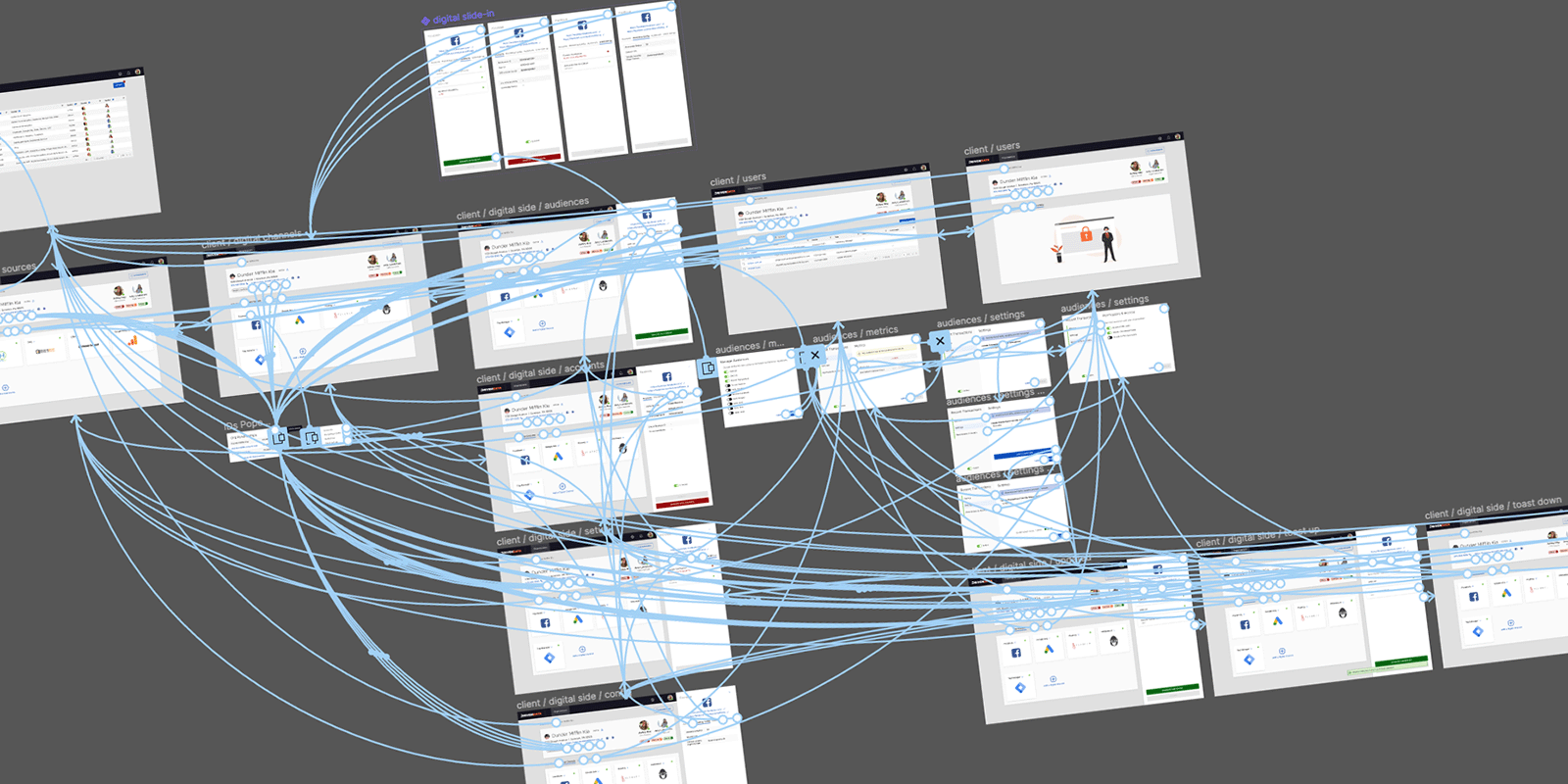
Figma prototype
Building a clickable prototype in Figma

Swapping Libraries

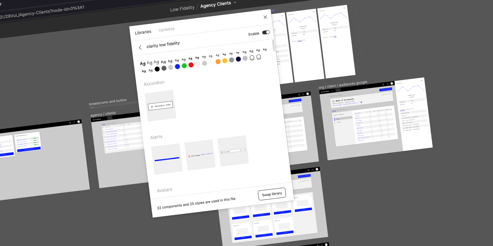
Moving to high fidelity was a single Figma operation. I duplicated the low-fi file and used the Swap Library feature to replace the low-fi component library with the production one. Every component updated in place. What would have taken days in Sketch took minutes, and the prototype was structurally identical to the low-fi version, just at full fidelity.

Swap Library in Figma
Figma makes it easy to convert to high fidelity

Applying the Findings

The low fidelity sessions gave me two clear problems to solve. The settings cog wasn’t reading as a menu entry point, participants were skipping past it or not recognizing it as interactive. I replaced it with a dropdown chevron on the card title, a pattern users already understood. For the chips, the issue was placement and visual weight. Moving them to the bottom of the hero reduced their prominence and let them read as informational rather than actionable.

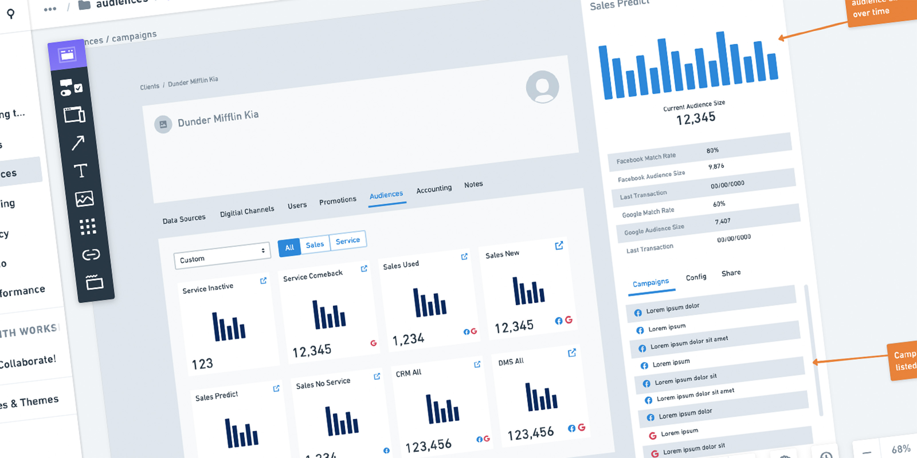
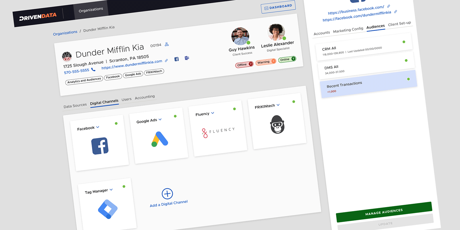
High fidelity mock-up
Moving to high fidelity

A More Complete Prototype

I added screens to the high-fi prototype that weren’t in the low-fi version. Participants would be seeing a polished design for the first time and I wanted the prototype to support natural exploration, not just steer them through two scripted tasks.

High fidelity prototype
A more robust high fidelity prototype

This feature was first brought to my attention on December 15, 2021. By February 10, 2022, I had designed two rounds of prototypes, run ten usability sessions, and delivered a validated design ready for engineering. One month.

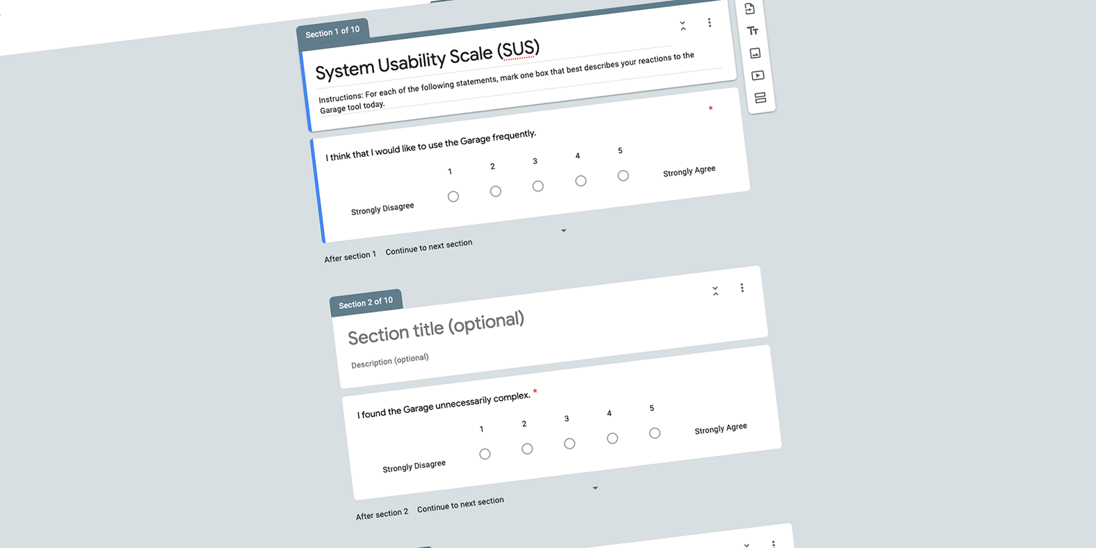
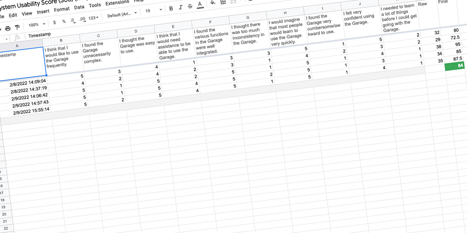
The high fidelity sessions ended with a System Usability Scalelaunch survey. I built the survey in Google Forms and automated the scoring in Google Sheets. The average SUS score is 68. Anything above that is considered above average.

The System Usability Scale survey
The System Usability Scale survey built in Google Forms

This prototype scored an 84, placing it in the 90–95th percentile with an “Excellent” grade. The single combined task took a minimum of eight clicks to complete. Average time was under a minute.

System Usability Scale results
Users gave this an “Excellent” score

Engineering would be building something that had been validated by users twice. Audiences launched in Q2 2022.

More Case Studies